How to Conduct Churn Rate Cohort Analysis to Improve Retention
16 MIN READ
|
Updated on November 24, 2023
High customer churn rates can be a major challenge for businesses, causing unexpected drops in revenue and decreased profitability. Worse still, many companies struggle to identify the root cause of churn and find effective ways to reduce it.
This can be frustrating and demotivating for SaaS marketers who are trying to grow their customer base and increase loyalty. Without a clear understanding of why customers are leaving, creating a strategy for improving user retention and reducing churn is difficult.
Fortunately, there is a process that can help businesses address this challenge: cohort analysis.
Cohort analysis is the process of identifying behavioral patterns in customers by dividing users into different groups. One of the most common uses of cohort analysis is to reduce churn. This is called churn rate cohort analysis.
In this blog post, we’ll explore what churn rate cohort analysis is, how it works, and how you can use it to reduce churn and improve retention. By the end of this post, you’ll have a clear understanding of how to conduct cohort analysis and use the insights gained to create a more effective retention strategy.
Cohort analysis is a type of analysis that groups users into cohorts, tracks their engagement, and studies how their behavior changes over a particular time frame. Churn rate cohort analysis specifically focuses on identifying patterns of customers who cancel their subscriptions, with the goal of improving the retention rate.
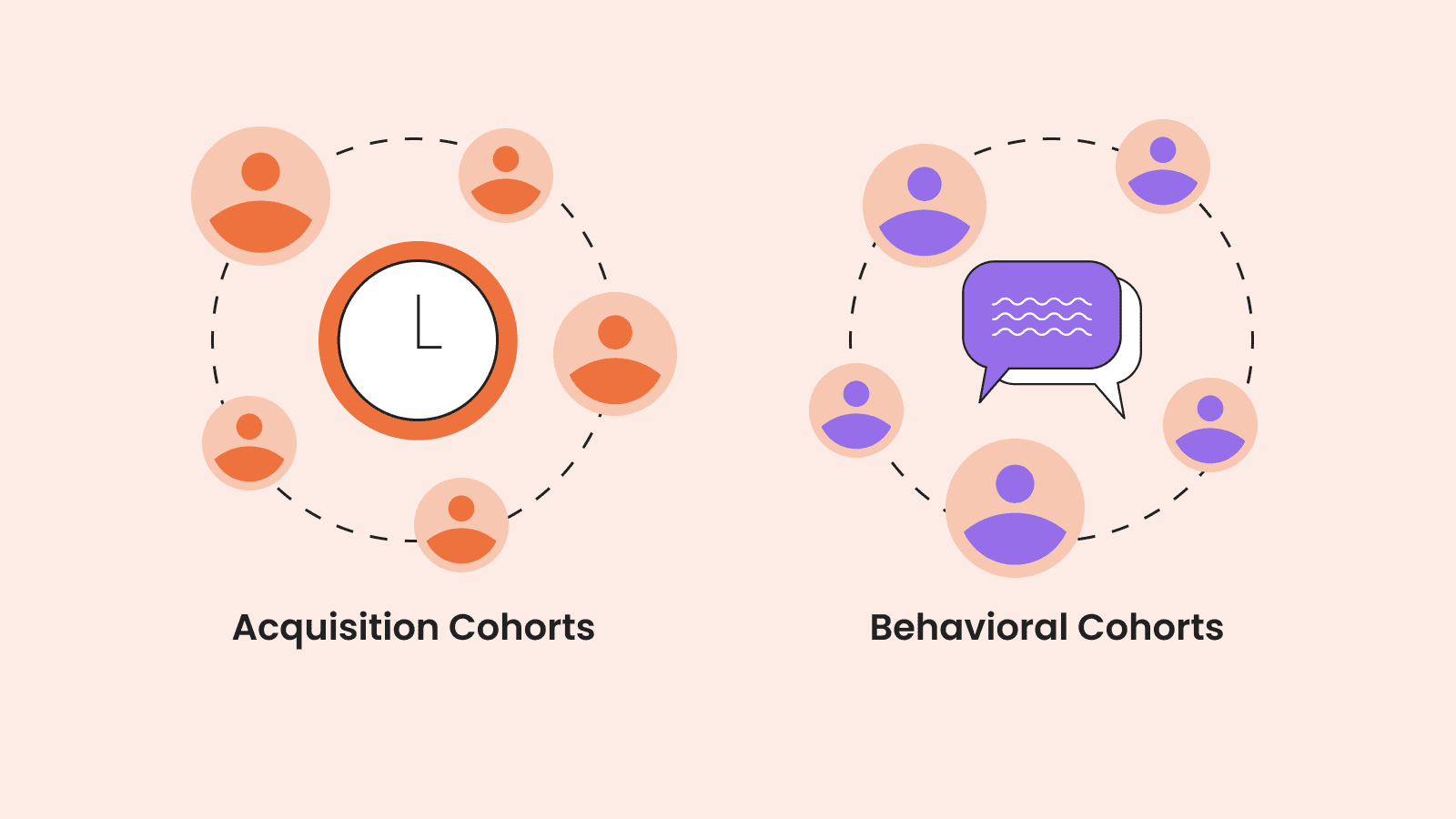
A cohort is a group of customers that share common traits. There are two main types of cohort analysis:
There are several other forms of cohort analysis that are less common. These include different cohorts like:
Because we are focusing on churn rate cohort analysis, it’s worth mentioning the difference between a cohort analysis and a churn analysis. Cohort analysis can focus on all users of the product and be used for a number of different reasons, as well as identifying the causes of churn. Churn analysis focuses only on users who churn and doesn’t separate those users into different groups.
One of the most common uses of cohort analysis is to improve customer retention and reduce churn rate. With acquisition cohorts, you’ll be able to see at which point customers churn during the customer lifecycle. With behavioral cohorts, you’ll be able to understand why those customers are churning — the actions or behaviors that most commonly cause them to cancel their subscriptions.
The better you are able to understand who they are leaving and why, the easier it is to take action and correct the course. That could be improving something about your product, changing your onboarding experience, or even targeting a specific set of people as customers.
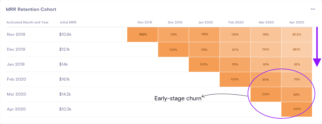
In the image below, for example, you can see an example of early-stage churn, which could denote a poor product-market fit or an issue onboarding new customers.
You can also use cohort analysis to understand your product and your customers better. It can highlight your product’s most popular features, show how a number of customers behave while using your platform, and even shine a light on your most valuable customers.
The main goal of churn rate cohort analysis is to identify the reasons for churn and reduce it. Below is a step-by-step guide to how you can use a combination of acquisition cohort analysis and behavior cohort analysis to identify when and why customers churn and then take steps to prevent it.
Great cohort analysis starts by asking the right questions. And that requires having a clearly defined goal. Your goal could be anything, such as improving your product’s conversion rate or uncovering the most popular features.
Given that we are looking at churn rate cohort analysis specifically, we’ll use the goal of finding out when churn happens for this example.
The questions you should be asking yourself will be something like:
For my example, I want to find out when customers are most likely to churn and the most common reasons they churn.
Once I know that, I can use the data to make changes to our product to optimize customer retention rates.
When you first run a churn rate cohort analysis, it’s sensible to group users into cohorts based on when they became subscribers. This is an acquisition cohort. Behavioral cohorts are important, but they can be used after you’ve found out when customers are churning.
You can group users by almost any period of time, but monthly cohorts will be a sensible choice for most SaaS businesses. If you expect subscribers to be active users and use your product every day, rather than a couple of times a week, then you could create daily cohorts.
In this example, we’ll use monthly cohorts.
At this stage, you’ll also need to gather all of the data you need to answer your questions. This will be fairly straightforward if you use a subscription management platform like Chargebee. Otherwise, you may need to combine data from different sources, such as your CRM and Google Analytics.
In this case, I need information about all of the accounts that have been signed up in the past 12 months, the retention rates of those accounts, and the MRR for that period. Once we dive into behavioral cohort analysis, we may need even more data.
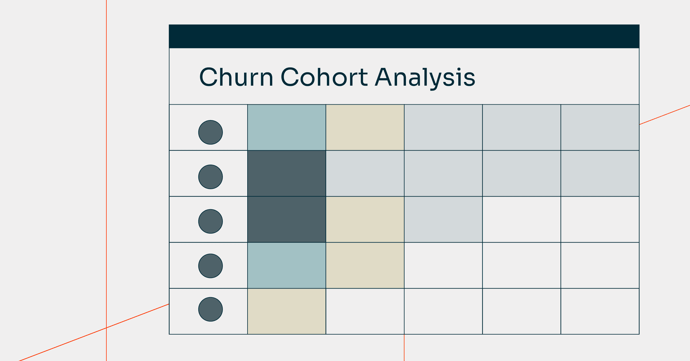
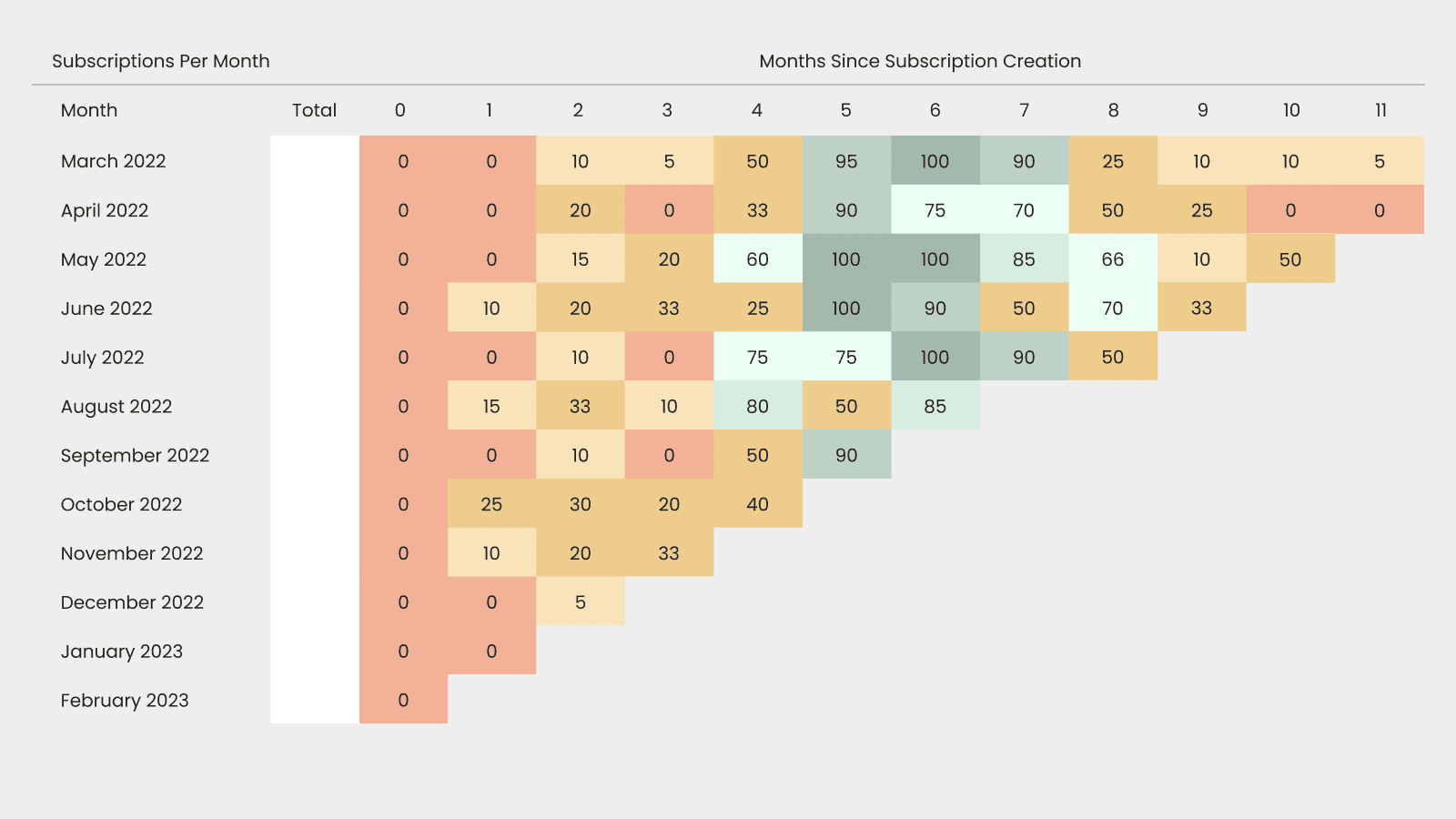
Once you’ve defined your cohorts, it’s time to create a cohort table. A cohort table shows the behavior of each of your cohorts over time.
The easiest way to create a cohort table is by using a subscription analytics tool like Chargebee. Free options are available, including Google Analytics, but these have some drawbacks that we’ll expand on below.
Cohort tables can seem a little overwhelming at first, but they are pretty easy to read once you get the hang of it.
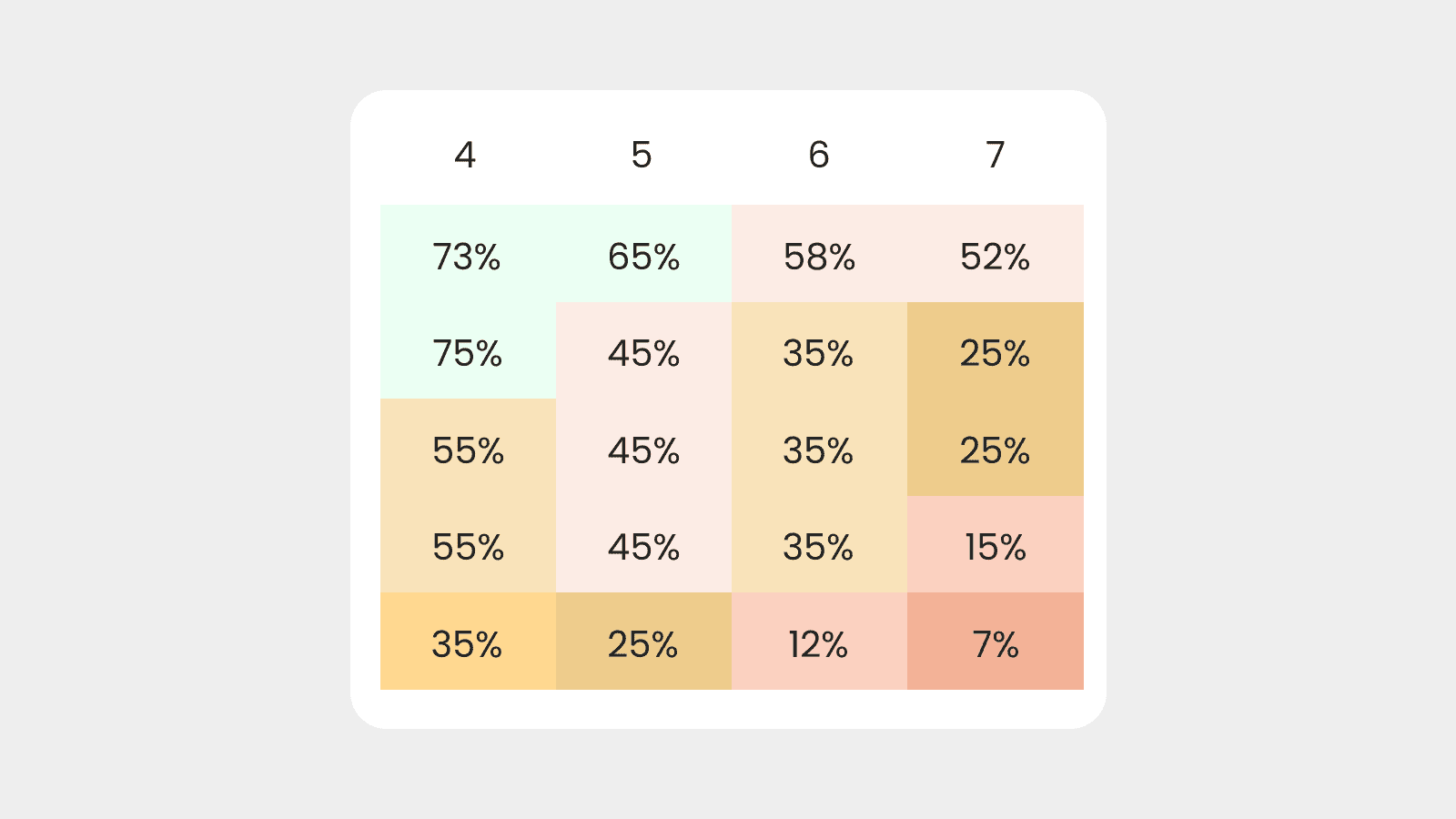
Let’s assume you are using an acquisition cohort as recommended. In that case, the vertical axis will show each cohort based on the month they joined. Looking at the example below, our first cohort is users who signed up in March 2022. Newer cohorts are listed below, and the entire acquisition cohort analysis covers a year’s worth of users.
The horizontal axis is the passage of time. The zero is the month that the cohort joined, and each number refers to the number of months they have been a subscriber. As you can see, the data covers the first cohort’s 11 months as a subscriber.
The cells in the middle will show the metric you are analyzing. In the case of churn rate cohort analysis, this will either be retention rate or churn rate. In the example below it is retention rate in the form of the percentage of active subscriptions.
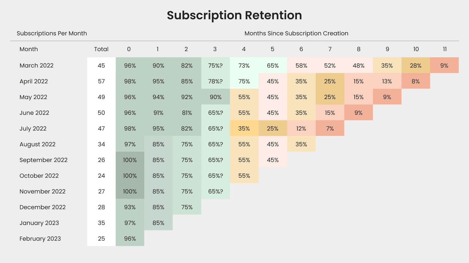
You can read a cohort table horizontally, vertically, or diagonally. Using the example above, a horizontal reading will show how each cohort’s retention rate changes over time. A vertical reading shows a retention rate in the same month of acquisition, and a diagonal reading shows retention rates in a specific month.
Knowing this, you can see that 65% of users who subscribed in March 2022 are still subscribed five months later.
A cohort table isn’t the only way to visualize churn, however. If you are looking at retention specifically, you can also create a retention curve. A retention curve shows the percentage of users in each cohort that are still active over a period of time. This can allow you to look at retention rates for behavioral cohorts, as well as acquisition cohorts.
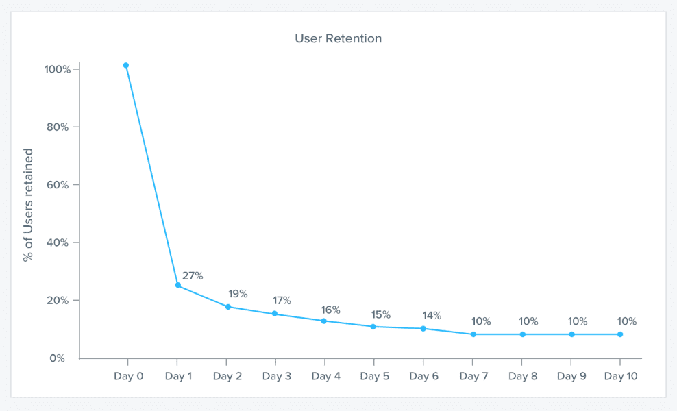
This makes it much easier to see the average retention rates for all users over a period of time.
With an acquisition cohort, it should be pretty easy to identify the point at which most of your cohorts start to churn.
You can make this process easier by color-coding your cohort table using green, yellow, orange, and red to signify levels of churn. In the image below, for example, a retention rate of 73% is light green. A retention rate of just 7% (i.e., 93% of customers in that cohort have now churned) is red.
Once you have figured out when customers in certain cohorts churn, you need to find out why. In our example, significant churn occurs after 4–6 months.
That could be for a variety of reasons, including price and a lack of useful features. You know your product and customers better than almost anyone, so hypothesize on the exact reasons for churn.
Then go and find out if you’re right. One option is to collect customer feedback during the cancellation process. This example from Harvest asks customers for qualitative data as they are leaving.
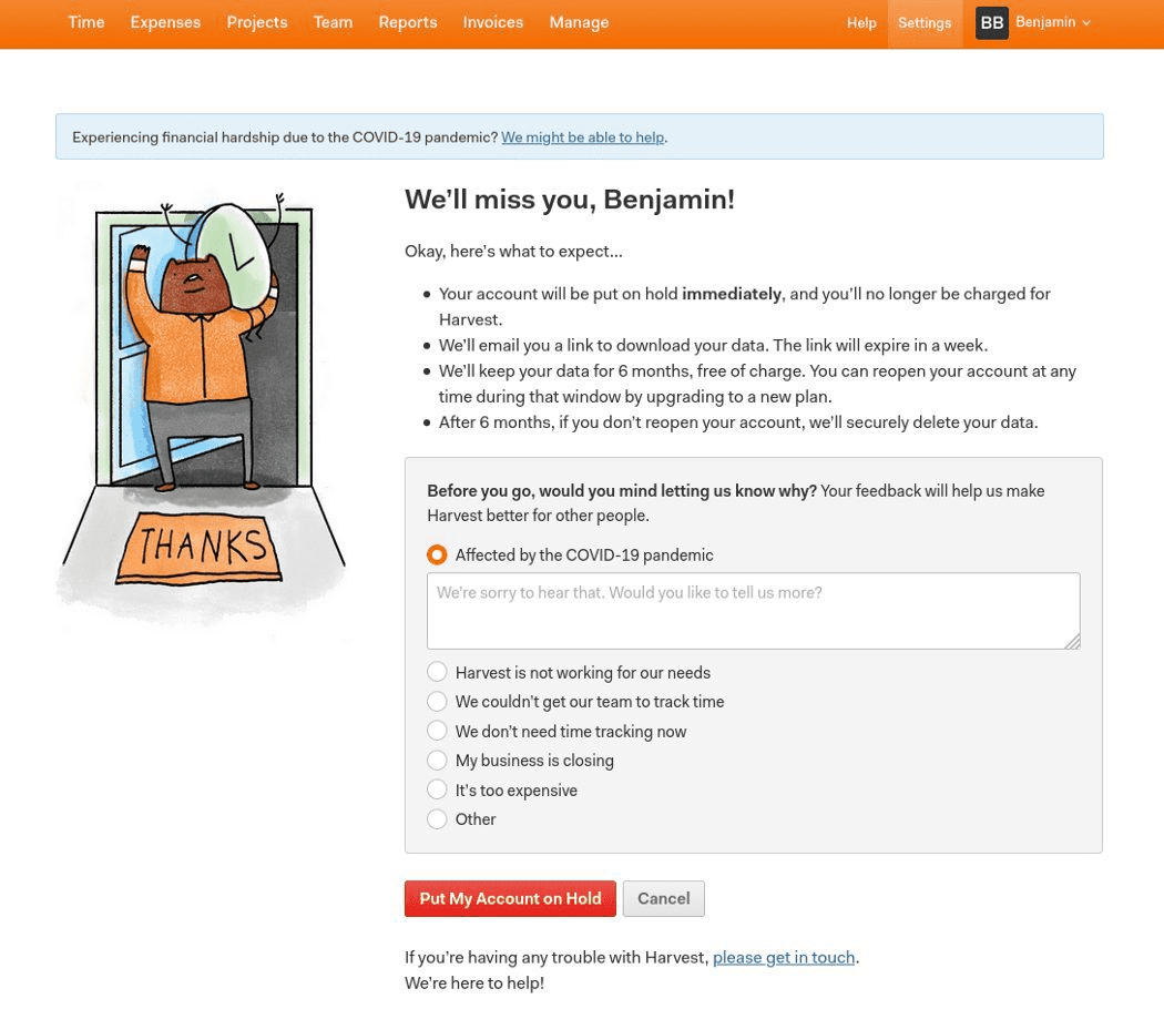
Adding a similar form to your cancellation flow can uncover a wealth of qualitative data that you can use to reduce churn.
Cancellation feedback forms can be incredibly helpful. But there is a more effective way to find out why customers churn and how to improve retention as a result: behavioral cohort analysis.
As we’ve discussed, behavioral cohort analysis divides a group of users into cohorts based on their behavior. This means you can test out your hypotheses for why users churn.
Let’s say you hypothesize that users are churning within the first few months because they aren’t completing your onboarding program. Running a behavioral customer cohort analysis is simply a case of creating one cohort of users who complete the training and another cohort of users who don’t. You could even create a third cohort of users who start the onboarding program but don’t finish it.
If the cohort of users who fail to complete onboarding churn significantly in the first few months, you’ve confirmed your hypothesis. If they don’t, that suggests a poor onboarding experience isn’t the reason they churned. You’ll have to think of another hypothesis and run another behavioral analysis.
Alternatively, you can leverage the qualitative data churning customers provide in your feedback cancellation form to see if those are genuine reasons for churn.
Finally, it is imperative you test your findings — otherwise, what’s the point in doing a churn rate cohort analysis in the first place?
Once you’ve identified reasons for churn, try to fix them as best as possible. That could be something as intensive as re-designing your onboarding experience or something as simple as signposting new users to your onboarding workflow.
If you’re really lucky, you may be able to run an A/B test to see if your hypothesis rings true.
Once you’ve taken steps to remedy the reasons for churn, you’ll want to run another churn rate cohort analysis in six months’ time or so. If you’ve been successful, you should see stronger retention rates when running acquisition-based analysis and lower churn rates related to the issues you’ve fixed when running behavior cohort analysis.
If you’ve already successfully conducted a churn rate cohort analysis, use these best practices to take your research up a level.
Your analysis lives and dies on the type of cohort you choose. It’s important that you don’t skip acquisition cohort analysis so you find out when customers are leaving.
But it’s also vital to create behavioral cohorts to find out why customers are churning. When doing so, make sure that you group customers based on characteristics and traits that are relevant to retention and the time at which most customers churn.
For example, there’s no point creating the onboarding-based cohorts we discussed above if the majority of customer churn happens 18 months after they’ve joined. Clearly, onboarding problems aren’t the issue here.
No one type of cohort analysis is necessarily better than another. Businesses should use two or more of these segments to understand how customers are actively using their products.
We have already combined acquisition and behavioral cohorts in the example above, but that should be the start of your analysis.
Unfortunately, churn is rarely ever the result of a single action. That’s why you need to compare multiple behavioral cohorts to understand the combination of issues that cause the bulk of your churn.
Cohort analysis is just one way to analyze customer retention and churn rates. Get a full picture of customer behavior by combining it with other metrics to get a complete picture of customer behavior.
There are several metrics you should track, including:
Monthly recurring revenue is the monthly income SaaS companies expect to receive. This is one of the most important SaaS metrics and a key indicator of business growth and health. MRR should increase as you decrease the churn rate through cohort analysis.
You can also analyze your retention efforts by calculating monthly revenue growth. This is a measure of how much your revenue has grown from one month to the next. Simply subtract the revenue of month one from month two, divide by the first month’s revenue, and multiply by 100 to get a percentage.
Net promoter score is a measure of your customers’ loyalty on a scale from -100 to 100. The score is based on a single question of how likely customers are to recommend your product to a colleague or friend on a scale from 1–10. People who score 9 or 10 are promoters, 7s, and 8s are passives, and anyone who scores a 6 or below is a detractor.
As churn reduces you should see an increase in your NPS among existing customers. At the same time, you can use the NPS score as a way to create behavior cohorts and determine to what extent NPS impacts retention rates.
Customer Lifetime Value (CLV) is the total amount of revenue customers generate over their lifetime. It tells you exactly how valuable each of your customers is and when averaged out, shows you the cost of losing customers early.
By reducing churn, you’ll also improve your CLV to CAC (customer acquisition cost) ratio. Ideally, your CLV should be at least three times higher than your CAC, but the higher the better.
No marketer should be creating cohort tables by hand or using Excel now. There are several free and premium tools that can automate the process.
Google Analytics, for instance, provides a free cohort analysis tool, which is one of the most underrated features of the platform. It’s not ideal for running a retention-based analysis, but it’s perfect for analyzing the impact of marketing campaigns and product-based activities. It also only lets you create acquisition cohorts.
Premium subscription management tools like Chargebee offer faster and more in-depth cohort analysis. For example, RevenueStory for Chargebee is a free tool for subscribers that provides subscription analytics and growth metrics. RevenueStory lets you build acquisition and behavioral cohort tables in seconds.
It’s not just analysis that Chargebee can help with. Chargebee Retention makes it easy to run A/B tests to validate your hypotheses and improve retention rates.
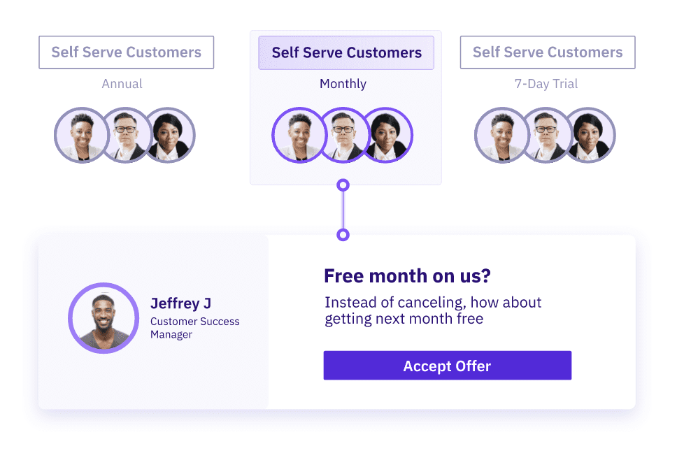
You can also use Chargebee Retention to run cohort analysis on your retention strategies to further analyze what works and what doesn’t.
As we’ve explored, churn rate cohort analysis is a powerful tool for understanding and reducing customer churn. But the accurate measure of its effectiveness lies in its application and the success stories it creates.
1. Tracking the Right Metrics:
2. Stories of Transformation:
3. Your Next Chapter in Churn Management:
Let Chargebee be your guide in the journey of customer retention. Uncover the hidden chapters in your customer’s journey, turn insights into action, and watch your churn rate transform into a tale of loyalty and growth.
Reach out to us for a demo, and let’s start writing a new chapter in your business’s success story together.