

What’s a heuristic analysis, how do your run one and why on earth does it matter?
If want to uncover new opportunities for optimization on your site or
Don’t have enough traffic or monthly conversions (300+) to run a meaningful, statistically significant A/B test or
You want to uncover any friction and roadblocks in your funnel so you can fix them and get those conversions up,
… Then a heuristic analysis may just be the thing you need.
Because when you run one – and you do it right – it can help you fix a whole lotta trouble.
In this workshop, I walk you through everything you need to know about running a heuristic analysis. Everything.
Including all these things you don’t wanna miss:
- The reason a heuristic analysis is such a powerful optimization tool (including the pitfalls you must avoid at all costs!)
- How to use Jacob Nielsen’s 10 usability principles to add depth to your analysis (So you can find out exactly where the leaks are happening and plug ’em up fast.)
- Setting measurable goals for your heuristic evaluations (plus the questions you need to ask yourself to smash these goals.)
And more.
To make the most of this workshop, grab the template I use to bring my findings together:
Table of Contents
Grab your heuristic analysis template
Watch the recording below:
Transcript and slides
This is a lightly edited transcript to make it easier to read- just in case you’d rather read through than watch!
And if you want to jump to specific sections, here’s your section guide:
- The purpose of a heuristic evaluation
- The pros of running a heuristic evaluation
- The challenges and constraints you’ll face when you run a heuristic analysis
- How to run a meaningful, optimized heuristic analysis using Jakob Nielsen’s 10 usability principles
- The 4 goals of a thorough heuristic analysis (and the questions you should ask yourself to smash each goal!)
- The step-by-step guide to running a heuristic analysis (with questions!)
I’m not going to give you too much background about heuristic analysis because I’m going to dive quite deep into it today. (There are some links at the bottom of the post if you want to dive in deeper!)
Heuristic analysis is a very cool process that I believe every single website should perform. Whether you’re just getting started with a website, or you’ve got a website that’s alive and kicking, or you have a new product that you’re launching…
Whatever it is, heuristic analysis can be an amazing way for you to discover various things that we’ll get into in just a moment. It’s also a great thing to do when you don’t have the resources to do other things.
What is a heuristic evaluation?
A heuristic evaluation, or heuristic analysis, is a process used to discover usability problems in any application or website. A UX heuristic evaluation serves four main purposes. It helps you:
- Discover usability issues
- Uncover hidden opportunities
- Find obstacles and key roadblocks preventing users from performing tasks
- Prioritize optimization needs
The way it works is that one or more experts — normally between three to five — work on evaluating the website against a set of principles and heuristics.
The entire process is designed to help uncover hidden opportunities on your website, find obstacles that need fixing and prioritize your optimization based on usability principles.
When can you run a website heuristic evaluation?
You can run a heuristic analysis on your website at any stage, whether you just have sketches on wireframes, or if you have a full-blown site that needs optimizing.
So let’s talk a bit about the purpose of it.
On the one hand, it’s about discovering usability issues. Heuristic evaluation is great at finding those usability problems on a webpage. It uncovers hidden opportunities, finds obstacles and key roadblocks preventing users from performing tasks on your page, and helps you prioritize your optimization stuff.
So, before we get started and talk about how you can actually perform a heuristic analysis, I definitely want to highlight the pros and the cons of running a heuristic analysis because there are many sides to it.
The pros and cons of running a heuristic analysis
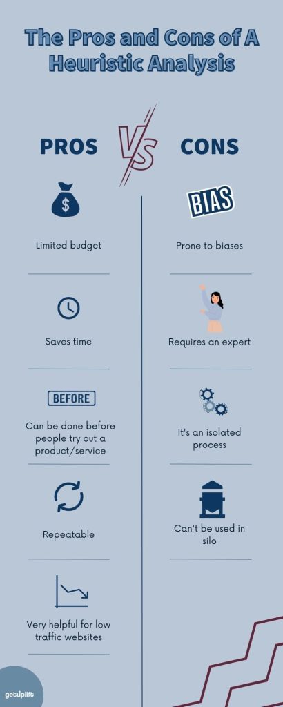
Let’s talk about the pros.
1. The process requires a limited budget
You’ll need about three to five UX experts to run the analysis, but that’s it.
You don’t need huge tools, you don’t need to spend a ton of money. It really is on a limited budget.
So if you don’t have a ton of money to spend now on mutuals and research, and employees or whatever the process is, then heuristic analysis is a great thing for you.
2. Running a heuristic analysis is fast
If you do it correctly, you can get a heuristic analysis done within a few hours.
That’s another thing that’s really cool because many times, a lot of these optimization processes take a ton of time to perform, and it takes a long time to get results.
So heuristic analysis or heuristic evaluation can actually be done in a few hours. So that’s a cool thing.
3. You can run a heuristic analysis before you launch
If you’re working on a new launch of a product or feature, you can run a heuristic test before people even interact with it.
That’s really cool, because then you’re actually going to discover a lot of issues you may have before people get to use it and complain, or have issues, or have problems performing certain tasks. So it’s a great way to do something before you launch.
4. It’s a simple, repeatable way to optimize your funnel
It’s also relatively simple to repeat this process every time you want to optimize a part of your funnel, launch a new product, or evaluate something else in your customer journey.
It’s very different than running A/B tests that normally would be only set up once, and you run it for a certain amount of time, and it takes a long time to get to.
Heuristic analysis, or heuristic evaluation really can be repeated many times.
5. It’s perfect for low traffic sites
If you don’t have much traffic or monthly conversions to run an AB test, a heuristic analysis can be the perfect fit.
In order to run an A/B test, you will need at least 300 conversions a month on your website.
It’s not that you can’t run an A/B test without it, but if you have less than 300 conversions of the same conversion- and I don’t mean sign ups and downloads and purchases, I’m saying 300 purchases a month, or 300 signups, or 300 downloads a month – it will take you a very long time.
Sometimes it can take six months or longer to run an A/B test if you don’t have that enough traffic, or enough numbers, enough conversions a month.
Running a heuristic evaluation can fast track that process for you, and help you find the immediate things that can be changed and optimized without running a test.
So these are all the cool things, and the pros of running a heuristic analysis.
The challenges and constraints you’ll face when you run a website heuristic evaluation
There are a few things that aren’t good about running a website heuristic evaluation.
1. Your cognitive biases can affect the results
As we discussed last month, during February on our persuasion and psychology month, we are prone to different cognitive biases.
Our personal opinions or emotions ( and biases) actually alter the results of the test. So that’s why when you do a heuristic analysis, you do it with a few people at the same time.
There are a few other options in order to avoid biases – and we’ll get into them – but you can compare it with Heatmaps, recordings, usability testings, user testings, or even confirm it with the Google analytics data.
That is one of the things that you really need to watch out for, your cognitive biases, or the biases that you just have emotionally towards certain designs and certain products, or certain features.
That’s why when you’re doing a heuristic analysis, it’s important to have more than one person do it.
2. You need expertise
The other thing is that you require an expert:
A UI or UX expert who can truly evaluate a site from a professional point of view. Now maybe you have someone on the team, perfect. If you don’t, then it might be a little hard to find someone. It’s not impossible, but it’s something that you have to spend some time and money on.
3. It’s done without input from your target audience
Contrary to A/B testing, a heuristic analysis is done privately without the involvement of your target audience.
This can lead to some wrong assumptions and incorrect evaluations. That’s why a heuristic analysis is always done along with other elements. It’s never done alone and just depended on. You always have to do more research in order to validate all this stuff.
You do have to remember that as opposed to A/B testing, it’s only you and your experts looking at the page. It’s not real users interacting with it.
4. A heuristic analysis should never be done in a silo
A heuristic analysis by itself isn’t enough. After completing it, I always follow up with user testing, onsite surveys, customer surveys, or other methods to verify what will be found.
While heuristic analysis is important and a very, very good tool, never use it in isolation. Just remember that you are prone to biases.
How to run a meaningful, optimized heuristic analysis using Jakob Nielsen’s 10 usability principles
Now that we’ve covered the basics of what a heuristic analysis is and the different pros and cons of it, I want to talk about how to conduct a meaningful, an optimized heuristic analysis that delivers the insights you need to optimize your websites.
There are many different metrics and rules you can follow when you’re performing heuristic analysis on your site, but the most famous and common one is Jakob Nielsen’s 10 usability principles.
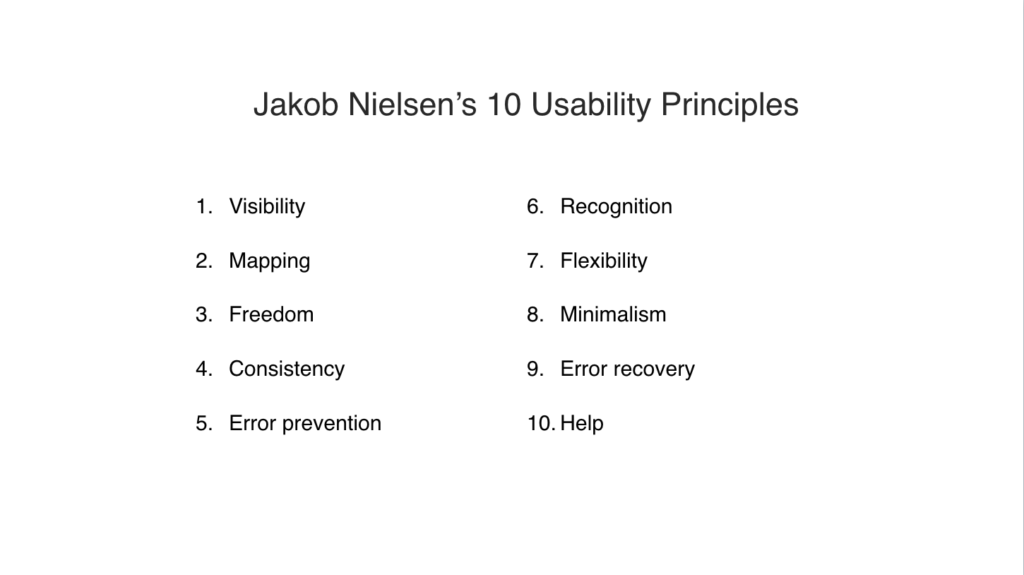
It’s the most used method for evaluation, and I strongly suggest using those if you’re just getting started. You can really just count on these 10, and you’ll be good to go. You don’t have to use all the rest.
Let’s review what his usability principles are. What I mean by that is that when he’s looking at a website, he’s evaluating each website or product page according to these principles, rules, and metrics. These usability principles form part of what’s called Nielsen’s heuristics.
1. Visibility
The page should always keep people informed about their status. You must always be able to tell as a user what’s happening.
This allows people to feel in control, to take appropriate actions, to reach the goal, and ultimately to trust the brand.
2. Mapping
Essentially for Jakob Nielsen, mapping means using the words of your audience.
The website, or the product should always speak the audience languages, the audience’s language with words, phrases, and concepts familiar to the user.
To do that, you’ll need to run different surveys on your website, to do some interviews and really get to know the language that people use.
What Jakob Nielsen says is, use those words. Don’t make up your own jargon, don’t try and invent the wheel. Use your customer’s words.
3. Freedom
The idea is that you provide good defaults, and options to undo your previous action.
People always make mistakes on a website, or take the wrong path in your journey so freedom means allowing them to easily return to the previous state, and rethink their steps.
A back button, for example, or having breadcrumbs and being able to click on the previous breadcrumb in order to go back. Just allowing that freedom of navigating freely from one step to the next.
4. Consistency
Your product and your website should always use the same interface and layout on all pages. You want to stay consistent with your design.
People should not have to wonder whether certain words or actions mean something else, and I’ve seen this constantly on various websites and various areas where you have different designs on different pages, different fonts, different colors, call to action buttons suddenly appear in different colors and all this is problematic.
5. Error prevention
Does your website help people avoid making mistakes?
Your website should eliminate all the screens, actions, or the words that may cause people to error, or misunderstand what’s going on. If possible, give people the option to confirm a certain action like “Are you sure you want to leave the screen?” Make sure that you know that when you leave this screen or if you log out, this information will not be saved.
The idea is to constantly give people the option to prevent the errors they’re about to take.
6. Recognition
The idea is to minimize the cognitive load that people have, their need to remember what to do next. People should not have to remember information on their own, and you should make sure that you’re providing clear instructions.
7. Flexibility
Make sure that different tasks and actions on your site are easy to perform for both beginners and for novice users, and this is key for really getting a good customer journey.
8. Minimalism
Provide only the most necessary information on a page in the most elegant way. The idea is to remove friction.
9. Error recovery
Essentially you’re helping users recognize, diagnose, and recover from errors.
The errors we make in a form, for example, should be clearly indicated and explained. So the idea is that when you’re filling out a form, and you make a mistake, don’t expect people to just understand that they made a mistake, but really tell them what that is and what mistake they made, and how they can fix it.
So it’s just a lot of the things here as you can see are about errors, about helping people move backwards and forwards, helping people prevent errors, or helping people recover from these errors that they’ve made.
10. Help and documentation
Lastly, making sure the user can find all the information that they need to perform certain tasks. Now this could be done with a help center, with a ton of resources in a knowledge base where it could just be done with tool tips or popups.
The idea is that these are Jakob Nielsen’s 10 basic principles for a heuristic evaluation. So make sure that you check out the complete guide. He really walks you through every single one of these steps and heuristics, and tells you how to notice them, how to recognize these issues and how to fix them.
The 4 goals of a thorough heuristic analysis (and the questions you should ask yourself to smash each goal!)
I would like to really get practical, and I want to talk about where you can store it and how to actually run your own heuristic analysis. So first things first, you have to reach a few goals.
1. Creating clarity

The idea is that each time you perform a heuristic analysis, your goals are to number one, provide clarity. So that’s one of the things that you will be doing while you are analyzing a website, and performing a heuristic analysis.
Your goal is to clarify the website, provide more clarity: to remove any concerns, roadblocks, or confusing elements and language from your customer journey.
That’s one of the goals of a heuristic analysis. To remove all of these issues. So people should know exactly what their next action should be, and be able to quickly find the answers to their questions. So here are a few questions that you can ask yourself while you are looking at a page.
If you are now reviewing a website, or you’re reviewing a pricing page, or landing page, there are a few questions you can ask yourself that will help you understand if the page that you’re looking at provides clarity or not:
- Can people tell within five seconds of landing on your page what you provide and what the value is?
- Is it clear what page they’re on, and what actions they can perform on the page?
- Does the visual hierarchy on the page, both the copy and the images, help the user? Can people clearly identify what their next step in the process is?
Those are the three questions you want to ask yourself on every page when you’re doing a heuristic analysis.
2. Ensuring relevancy
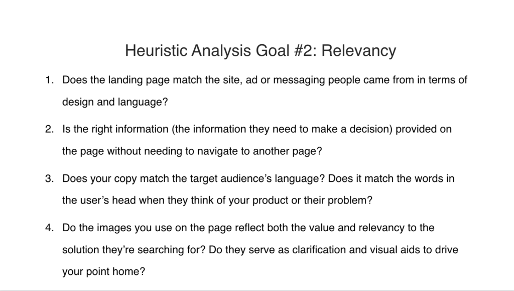
Goal number two is ensuring that the page is relevant.
People should always feel that they are in the right place, and in the right direction of achieving their goals.
The information that they receive on each page should be only relevant to the page that they are on, and the next steps should be very clear. That means that it’s also relevant.
Here are a few questions you can be asking yourself when you are doing that heuristic analysis:
- Does the landing page match the site, ad, or messaging people came from in terms of design and language?
- Is the right information, the information they need to make a decision provided on the page without needing to navigate to another one? Now this is actually one that most websites do fall on number two, where you send people to an additional page to read more when there’s not really any need to, and you could be providing that information on the first page.
- Does your copy match the target audience’s language? Does it match the words in the user’s head when they think of your product or their problem?
- Do the images you use on the page reflect both the value, and the relevancy to the solution they’re searching for? Do they serve as clarification and visual aids to drive your point home?
When you’re reviewing your page, and you’re trying to reach goal number two, you want to ask yourself these four questions.
3. Removing friction
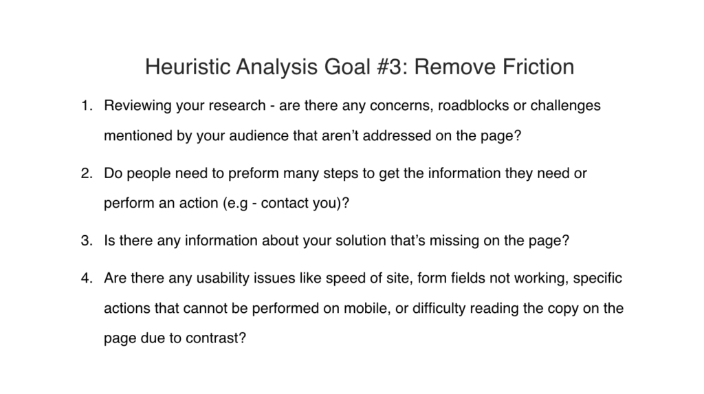
The heuristic analysis process basically helps identify elements on your website that create friction. Your goal is to find these friction points and remove them.
Go back to any surveys that you’ve done, polls, interviews, anything where you’ve really done some customer research and ask yourself:
- Are there any concerns, roadblocks, or challenges that were mentioned by your audience that aren’t addressed on the page?
- Do people need to perform many steps to get the information they need or perform an action?
- Is there any information about your solution that’s missing on the page?
- Are there any usability issues like the speed of the site, form fields that are not working, specific actions that can’t be performed on mobile, or maybe difficulty reading the copy on the page due to contrast or font size, and stuff like that.
So these are specific questions that you can be asking yourself when you’re trying to remove friction from the page.
4. Remove distractions
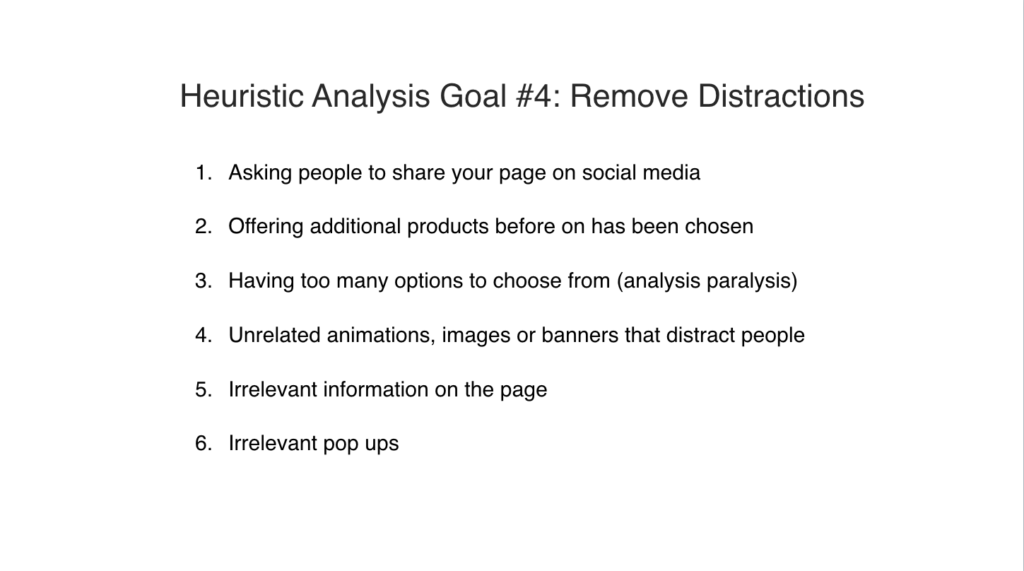
Any action or element on the page that isn’t directly contributing to helping people achieve their desired goal is a distraction.
Imagine trying to focus on a task at work, and being constantly called, messaged, emailed and talked to. That’s what most experiences on a website feel like. Right?
Here are some questions that you can ask yourself:
- Asking people to share your page on social media. So for some reason, we see this a lot on landing pages too when people arrive on a landing page, and for some reason, these websites have added a way to share on social media. That is a distraction that isn’t called for.
- Are you offering additional products before one has been chosen as an … Before one has been chosen? Do you have too many options to choose from? Reminder, we spoke, I think it was last week about analysis paralysis, a cognitive bias that basically determines that when we have too many options, our brains opt out.
- Do you have too many options to choose from?
- Do you have any unrelated animations, images, or banners that distract people?
- Do you have any relevant information on the page that doesn’t contribute in any way?
- Do you have any irrelevant popups on your page?
Now these are just some of the questions that you can ask when you’re approaching a heuristic analysis, but they’re a great place to start with and they can set you in the right direction.
So we spoke about four goals of a heuristic analysis, and the different questions that you can ask yourself. Now let’s talk about what you should be evaluating during your analysis. So how to actually do heuristic analysis.
The step-by-step guide to running a heuristic analysis (with questions!)
There’s a few things you want to be looking at.
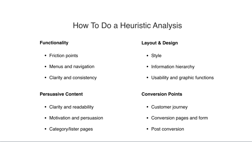
You want to be identifying friction points, menus and navigation. You want to be looking at the clarity and consistency. That’s with functionality.
You want to be looking at the content- so that means persuasive content on each page. Clarity and readability, motivation and persuasion, category and list of pages.
You want to be looking at the layout and the design, the style, the information hierarchy, the usability and the graphics.
So these are all the things that we want to be looking at, and evaluating while we are doing a heuristic analysis.
Lastly, conversion points. Essentially, the place where the conversion happens. This can be on a checkout page, pricing page, wherever the conversion is. maybe it’s a subscription page, we want to be evaluating the customer journey, the conversion pages and forms, and post conversion.
Essentially we want to be talking about thank you pages and stuff like that, but let me dive into each one.
1. Evaluating page functionality

When we talk about functionality of a website, you want to ask yourself specific questions like:
- Can people navigate and reach their goals in the easiest and most efficient way possible?
- Does the main navigation indicate where people are in their customer journey in their process?
- Are the major sections of the site available from every page? So that means is your navigation actually working well? Does it include the most important sections of the site?
- Can people perform the same actions on mobile easily? That’s functionality.
- Do instructions and messages appear on the same place on each page?
So when you get to the stage where you are evaluating the functionality of the page, these are some of the questions you should be asking yourself.
2. Evaluating your content

When you get to content, there are a few questions you should be asking yourself too. I’m not just talking about blog posts, I’m talking about the whole content of each of your pages.
If you’re doing a website heuristic analysis, every page you review, you should look at it from a functionality point and the content on the page:
- Does the website, does the page communicate effectively, efficiently, and persuasively?
- Are the words, phrases and language used on the site familiar to an average user? So I think I gave this example a couple of weeks ago showing a screenshot of zoom. They had their bullet points there, and some of their bullet points include all these really weird letters and words. I had no idea what they meant. They were very confusing. So when you’re looking at your page, are you using words and language that are familiar to an average user?
- Are the language and tone of voice consistent across channels and messages?
- Are formatting elements like bullet points, bolding, paragraph spacing, are they used where it’s possible to simplify reading?
- Are call to action buttons and links descriptive and motivational?
- Is social proof clearly displayed and used to solve objections and consents?
When you’re looking at pages that have lots of content on them, or even a landing page, or if you’re evaluating a pricing page, or whatever that pages, these are the questions you want to ask yourself regarding the content.
3. Evaluating page design and layout

Then we reach design and layout. So you’re looking at a page and you should be asking yourself:
- Does the website appear clear, easy and intuitive to use?
- Are the pages quick to scan, so can people actually skim it? Clear headings, subheadings and short paragraphs.
- Is there a clear visual starting point to every page? So what I mean by that is when someone lands on the page, is it completely clear to them where they should start their evaluation? Where they should start reading? Many times you’ll see huge blocks of texts, one next to each other, no white space, everything’s the same color, everything’s the same font, and it’s really hard to understand where we should even start. Now it’s not just the reading element, it’s the whole hierarchy of information. So is it clear what you need to do, how you need to read the page, what you need to click on, what you need to scroll to. If you have any, I don’t know, maybe animations on the page or things that people can play around with.
- Does each page on the site share a consistent layout? Unfortunately, many websites don’t.
- Is the copy easy to read? Font size, contrast, colors, all of the stuff.
- Does it work in terms of easy to read and readability?
- Do people really understand where they start and where the page ends?
Those are the questions about design and layout.
4. How effective are the conversion points?

Conversion points are those pages that people convert on.
The questions you might want to ask yourself are:
- After people select a relevant CTA, is it visually shown that they’ve accomplished the task?
- After people complete an action, do they get a thank you page?
- Are any additional costs like shipping communicated clearly throughout the user journey?
- Is there a clear path into checkout, the payment page, or contact page?
- Are people shown the different stages in the checkout from start to end?
- Are relevant trust symbols, icons, quotes, provided to increase trust during the conversion.
So these are some of the questions you want to be asking yourself when you’re reviewing conversion pages.
How do you actually prioritize your heuristic analysis?
So we went through the goals that a heuristic analysis has. We went through the different types of things you should be looking at on each page.

Let’s say you have gone through everything, you’ve written down all of your answers and not just you. Again, it’s you and hopefully three or four other UX specialists, who are going for the website and evaluating it.
How do you prioritize what to actually fix and what to approach?
Essentially what you want to do is grade it according to problem severity. So I actually suggest scaling the results that we’ve seen from one to four. So one being a minor fix that can be done by a cosmetic change, and isn’t a burning change. Two, requires a fix with low priority. Three means high priority, and four is that it’s catastrophic and it needs to be immediately solved.
So the way I actually grade them is according to the impact on users, the revenue for the business.
So it’s how does this impact the users, and how does this impact the revenue of the business? For example, when I’m trying to grade a certain heuristic issue that I’ve found, I’ll ask myself:
- How common is the problem on the site?
- Is it an issue people can overcome on their own, or does it demand a fix?
- Does it affect the main flow or journey of the website?
- Does it affect bottom line? So does it have impact on measurable conversions?
- How long will it take to fix what resources are required? What I mean by that is time, money, team. The less resources needed, the better the score.
What I do is I put together a very simple spreadsheet that you fill in. So here’s a screenshot of it.
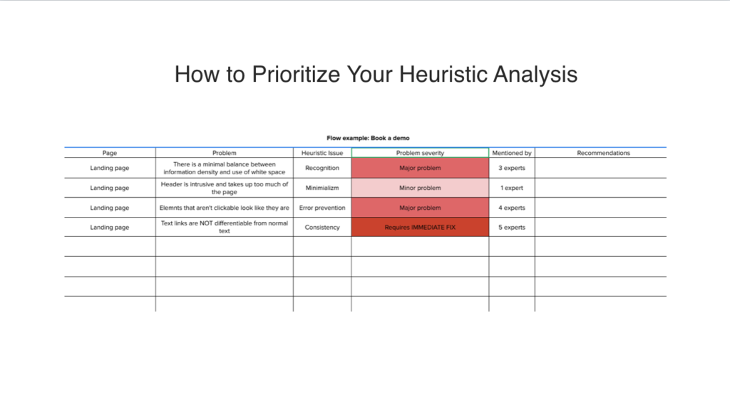
On the left, you are writing down what page you are on: a pricing page, landing page, about us page, whatever, signup page.
Then you’re writing down the actual problem that you’ve found. So examples that I gave here is there is a minimal balance between information density and the use of white space. The header is intrusive and it takes up too much of the page, or elements that aren’t clickable look like they are, or texts links are not differentiable from normal text. So this is the problem.
Then I match it with the heuristic issue.
So I go back to Jakob Nielsen’s list, and I find where does this fit in this issue?
Then I rate it according to the severity. Is it major, is it minor? Is it a quick fix or does it require an immediate fix? How many people mentioned this?
If one person mentioned it, then maybe it’s not that big of an issue. Again, if for experts or five experts mentioned that you can’t differentiate between links and normal text, and it requires immediate fix and it’s also easy to do because you don’t need a design team, and you don’t need developers, you just need someone to go in and fix that in terms of color, then that gets a priority.
This is just a quick way to evaluate everything, put everything in a spreadsheet and it makes it so much easier to actually follow through, and identify the most important elements that need to be fixed.
So essentially you’ve gone for your entire heuristic evaluation, you have put it in a spreadsheet and you have prioritized what is the most important aspects that needs to be fixed, and you’ve graded them. So it looks like texts links that look like normal texts are the most important one. Then we have two more who are major, and then we have one last one which is minor.
Ten you can prioritize them, but next you’ll probably need to present this to your team or maybe your clients, to your manager. So to do that you will need to summarize all of your findings, and present them in a way that highlights the most important elements, and is also highly actionable because no one’s going to want to look at the spreadsheet.
It’s like showing people growths on Google analytics, people just completely lose you. So here’s what I include in my presentation. When I’m presenting to a client, I do a keynote or PowerPoint deck. Essentially what I include is the following, the process that I went through. So just a quick review of who did it, how we performed it, what pages we looked at, and just a quick brief just so people can understand how in depth this was, and then it wasn’t just someone making things up as they were going ahead.
If we used Jakob Nelsen’s heuristics, then I will provide that list and I’ll quickly run them through what each heuristic means, but just as a general note, just to say these are the principles. It really puts in the foundation of trust, so they can see that it’s built on very specific metrics.
Then the major problems that we found. So essentially, what are the biggest issues that need fixing. Numbers and impact, so okay, we’re saying that these two, three, five problems are the biggest things that need fixing. So next it’s up to us to prove numbers and impact. So numbers means essentially, how is this impacting us?
If you can go into Google analytics and show that there’s a big drop off, if you can look at Heatmaps and say we can see that this is a consistent issue because we can see that people are clicking around here, and they don’t know what to do, or we can see in recordings, or we’ve interviewed people who’ve done user testing and they’ve all validated this.
Then these are the numbers, and the impact of what it can do when we change it and optimize it. Of course, prioritization. So what are we going to do first? What are we going to do second? What are we going to do lost? The actual solutions that we’re proposing. So if we know that we have a problem with the fact that links look like regular text, then obviously the solution is quite easy.
There are many issues that we’ll find that might be problematic, and we need to come up with good ideas that will show our team or our clients that we have solutions, and that they’re not going to be too overwhelming. So they’re not going to require too many resources to get them done.
Q&A
Should you include the names of the experts who did a heuristic analysis?
So you can include the names of the people who run the heuristic analysis. I don’t know if that’s important. I mean it depends again, if you are in-house or if you’re doing it for a client.
If you’re doing it for a client, I wouldn’t necessarily mention who the experts are. You are the expert that they hired and you can just say, we had three, four, five experts evaluate this page. It’s not really any of their concern to know who they were.
If you’re in-house and it’s a big company and you want to talk about the people and give credit to the people who did it, then of course you should mention their names, but I don’t know if it’s that important of a thing, but you do need to say that experts reviewed the website and those are the people who did the heuristic analysis, and not people that are just bystanders. That is it essentially.
So you present your heuristic analysis to your team, and you get started with the fixing. Now this is really a quick overview of a heuristic analysis. As you can see, there’s a lot of different elements to it, right? I mean there’s all sorts of rules or metrics that you can follow, but essentially a heuristic analysis when you really look at it as the bottom line, it’s all about asking the right questions.
So first choosing the page that you want to valuate, or the product, or the funnel that you want to analyze. Then making sure that you’re reaching these goals of clarity, of relevance, of removing distractions, of removing friction. Then just keep asking yourself questions about the design, about the functionality, about the devices, about the conversion pages, about the content.
The more questions you ask yourself about each page, the better insights you’re going to get. Of course, as I said, that’s when you cross reference it with all the rest of your research.
Are there any differences that apply for desktop applications that you would suggest that I keep in mind?
So one thing that I didn’t really mention much during this slide deck, or workshop is the whole idea of mobile.
So I mentioned that I think just once, when I was talking about functionality. What’s really important when you are doing this heuristic analysis is to also do it on mobile. You can even open a new spreadsheet just for mobile, and keep asking yourself the same questions because many times the things that we can do on desktop aren’t necessarily that easy to do on mobile. For some reason, even though the entire world is mobile, we keep forgetting about it.
So David, I would definitely suggest performing your heuristic analysis on both desktop and mobile. I think that will definitely be very helpful, and very good to keep in mind that it needs to be done.
Does accessibility for visually or audibly impaired users become necessary in the near future? It seems that we do not give enough consideration to this aspect of UI and UX.
That is such an important question. It really depends on the, unfortunately, it really depends on the country that you’re in. There are different laws in various countries that you have to provide accessibility to different people.
So I know that in Israel for example, there are very strict laws that you have to have a special pop up that allows people who have disabilities to actually choose disability that they have, and that automatically changes the website to help them perform the actions that they need. So I think it’s a very important question, because that also is a very huge part of a heuristic analysis.
At the end of the day, our entire goal is to make sure that people have a good, consistent and easy to use customer journey. So that’s part of it and I would definitely, definitely look into it. Hopefully that answered your question.
Where do you find your experts for heuristic evaluations?
Well that’s a very good question. So if you’re in-house, I would say that you would want to, you can reach out to people who are designers or UX experts in the company. However, remember we talked about biases, so many times people really do love their design, or they don’t want to admit that there’s something wrong with their design.
So it might be harder to get people from within the team to actually perform this in a unbiased way. I would actually suggest trying to reach out to other people, and asking for their help. Now you can do this by reaching out to other companies who have UX designers, and asking them for their help and then maybe providing it for them. So you could swap between you, you can hire UX experts.
There’s so many around there that you can use. So I’d definitely go about that. I’d try to avoid using people in-house just because of those biases. People don’t really like to admit that things are wrong with their design. So that’s what I would do.
Post heuristic analysis, what services do you then offer? What more will you then do for the client?
Okay, so here’s the thing. A heuristic analysis in my process in the emotional targeting framework is part of my research. I’m not just doing the heuristic analysis. I’m running polls, I’m doing surveys. I’m looking into Google analytics, I’m looking into all sorts of sheets of data in Google Tag Manager. I’m doing interviews and I’m doing voice of customer research. So we’re doing a lot together, and we’re constantly comparing things.
Nothing is a silo, and it’s one of the things that I mentioned at the beginning is that it really is important to remember that a heuristic analysis can’t be done in a silo. A survey cannot, a poll, interviews. Everything has to be matched. So when we finish performing that heuristic analysis, we will then go back to all the rest of our research and figure out, okay, does this correlate? Is this different than what we’ve been seeing in other places? How does this work together and how can we use it to optimize the website?
At the end of the day, my job is to optimize websites for my clients, or help my students optimize their websites. So I do that by aggregating all of that research together, and finding those common themes and segments that we can use. So hopefully that was helpful.
Do you use web content accessibility guidelines?
I do for specific websites according to the country that I’m working with. As I mentioned before, each country has their own laws and stuff. We do have strict laws in Israel and in England for accessibility. So you can actually log into even government pages and websites to find the laws and accessibility guidelines for your country. It’s just the thing you should check out.
Unfortunately, there isn’t enough content on it, on this subject and I think it is well worth the time to read as much as you can about it, but I’m not sure. I can’t give you too much information about it myself.
Resources I mentioned:
- 10 Usability Heuristics for User Interface Design
- The Design of Everyday Things
- First Principles of Interaction Design
- The Eight Golden Rules of Interface Design
Facebook Comments
Powered by Facebook Comments
which is better your own heuristic or Jacob Nielsen? Jacob Nielsen heuristic basically are task-based? I am new not understanding which one to use?
We use Jacob Nielsen’s questions and breakdown to complete the spreadsheet and audit the site
great stuff!
splendid work, really helped me pull off the heuristic analysis considering this is my first project.
So helpful. Thanks Talia! R ox
pls do I need any tools to test or evaluate the usability of a website