With both B2C and B2B companies spending increasing amounts of money on SaaS apps annually, it’s only natural that entrepreneurs have become even more enthusiastic about the SaaS industry. In fact, the following statistics prove that launching a SaaS startup can be a lucrative idea:
- Companies constantly expand the number of SaaS apps they use. In 2020, companies used 80 SaaS apps on average, and in 2021, this number rose to 110.
- Saas-based apps accounted for 70% of all software used by businesses in 2020. This number is expected to rise to 85% by 2025.
So, how can you find success in a market that promises a great demand for cloud-based software but entails heavy competition?
Primarily, we recommend that you focus on your Saas website’s user-centricity.
One of the best ways to ensure that your customers stay with your brand is to have a very user-centric approach to everything in your company. And it’s especially important when it comes to your website’s design. Some great SaaS website design practices include an intuitive user interface and actionable, attention-grabbing content.
The valuation of SaaS companies is also directly related to the customer lifetime value and how well their websites are designed in terms of delivering the most value to their users.
The following are the six best ways to ensure your SaaS website prioritizes user-centricity.
Simplify Your Processes
You’ll often stumble upon a SaaS website that delivers its product to its customers in a complex, incoherent way. The result is usually an overwhelmed visitor. They will most likely become confused and unsure if this company is the real solution to their problem and leave.
To avoid this, you simply simplify. It’s crucial that you declutter and ensure your website’s design is lightweight and straightforward.
The goal here is to demonstrate how your software operates with as few words as possible. Limit the product’s description to a few short sentences. Use custom graphics, illustrations, or even screenshots and stock videos of your product inaction to make the communication process even simpler.
This is the approach taken by the designers of the Flamingo home page. They understood that many of their potential customers won’t know what their product is capable of, and that they needed to communicate this as quickly and as clearly as possible.
Flamingo kept information to a minimum, they also broke complex functions down into short statements of value rather than overwhelming visitors with complex concepts. And they supported all of this written info with plenty of visuals.
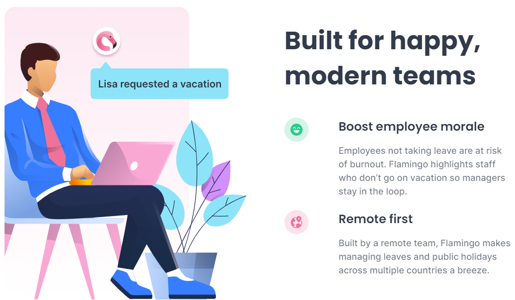
Source: Helloflamingo.com
Intercom, a customer communications platform, adds simple, separate sections for each solution their software provides. They are reinforced by animations and clever infographics that effectively explain how clients get what they’re after by signing up for their product.
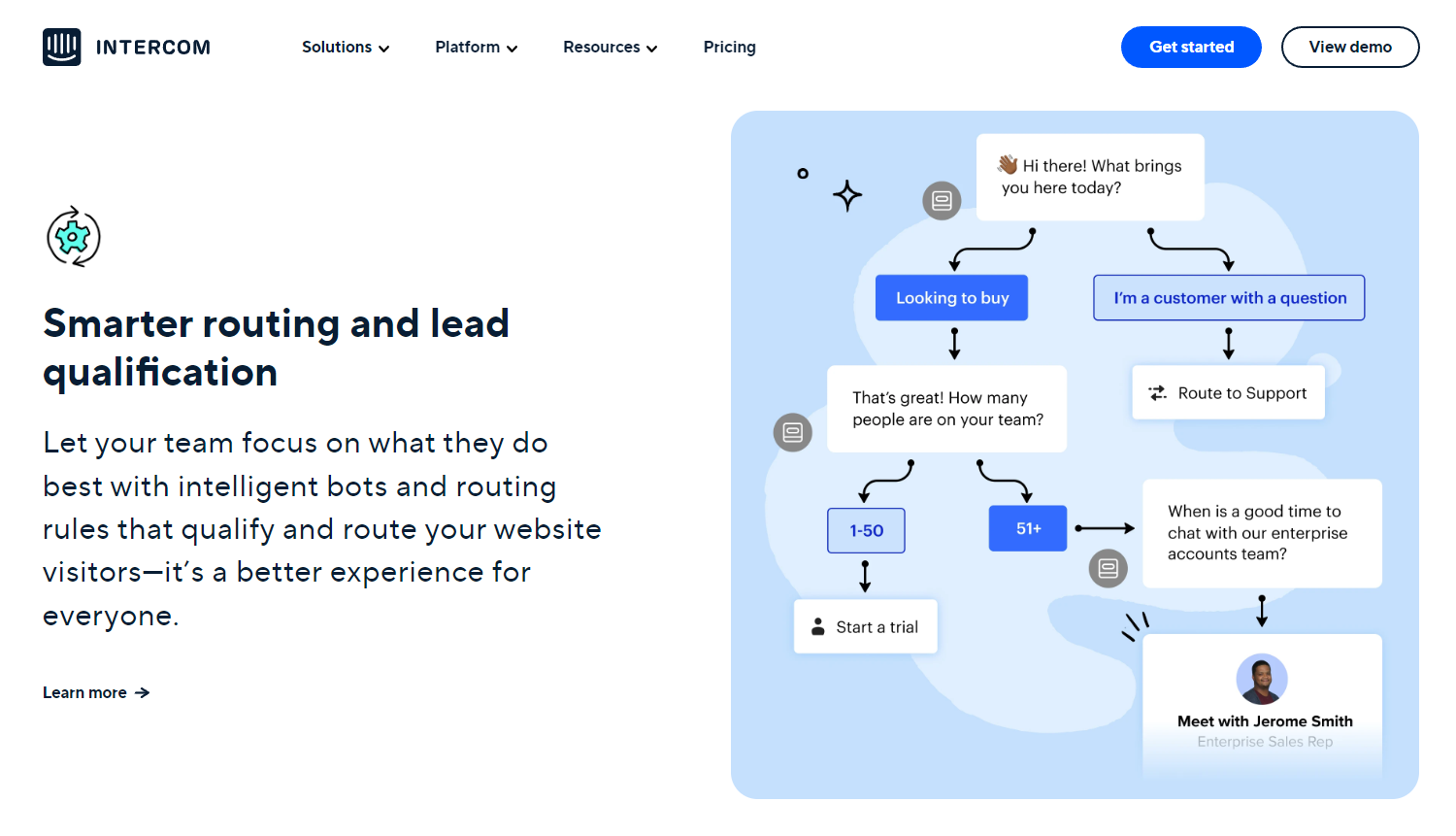
Source: Intercom.com
Give Users Relatable Social Proof
All SaaS companies can leverage ongoing or past relationships they have with their clients so they can showcase their reliability and success and inspire higher conversion rates.
There are tons of ways you can capitalize on incorporating social proof in your SaaS website’s design. The most effective examples include:
- Displaying logos of prominent clients
- Showcasing informative customer testimonials
- Placing product reviews on eye-catching spots
- Featuring customer stories that explain your solutions
Social proof is a great way to convert your visitors into loyal customers. Learning about your software solution through the shared experiences of satisfied users will help answer any questions and reassure them that your product is the right fit for them.
If the segments that you decide to include testify to the positive outcomes of using your solution, prospects will instantly relate, put trust in your brand, and increase their willingness to do business with you.
The famous AI-driven analytics platform, Tableau, is a great example in this regard. Their Customer Stories section provides insight into how their software helped big businesses thoroughly analyze their processes and make better, data-driven decisions.
Tableau’s customer stories have a dedicated page on their website, but they’re also featured in a section on their homepage so they can effectively grab the attention of more visitors.
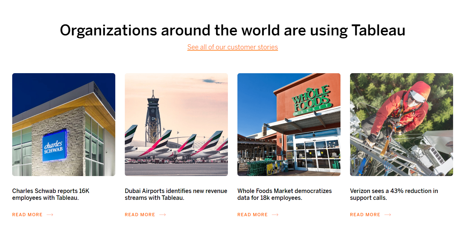
Source: Tableau.com
Highlight User Rewards Over Product Features
Earlier, we spoke about how cluttering your SaaS website with too much information can have negative consequences. Overdoing it with unnecessary elements and content may repel your customers and simply drive them away.
We understand that your software offers many amazing features, but your clients aren’t going to appreciate it if you cram all that information in their faces.
That’s especially the case with technical features. Ordinary users and even high-scale companies usually don’t care how every single detail of your tool works. What they care about are the rewards they’ll get by using your solutions.
Bottom line: don’t hit the technical side of things too hard. Instead, limit the content discussing your SaaS product’s technical features to the bare minimum.
This is how Sketch delivers their pitch right from the get-go. This is a SaaS tool for graphic and UX design that enables collaboration within teams. Take a look at how they explain what their software is about and how their main features can help you achieve your goals.
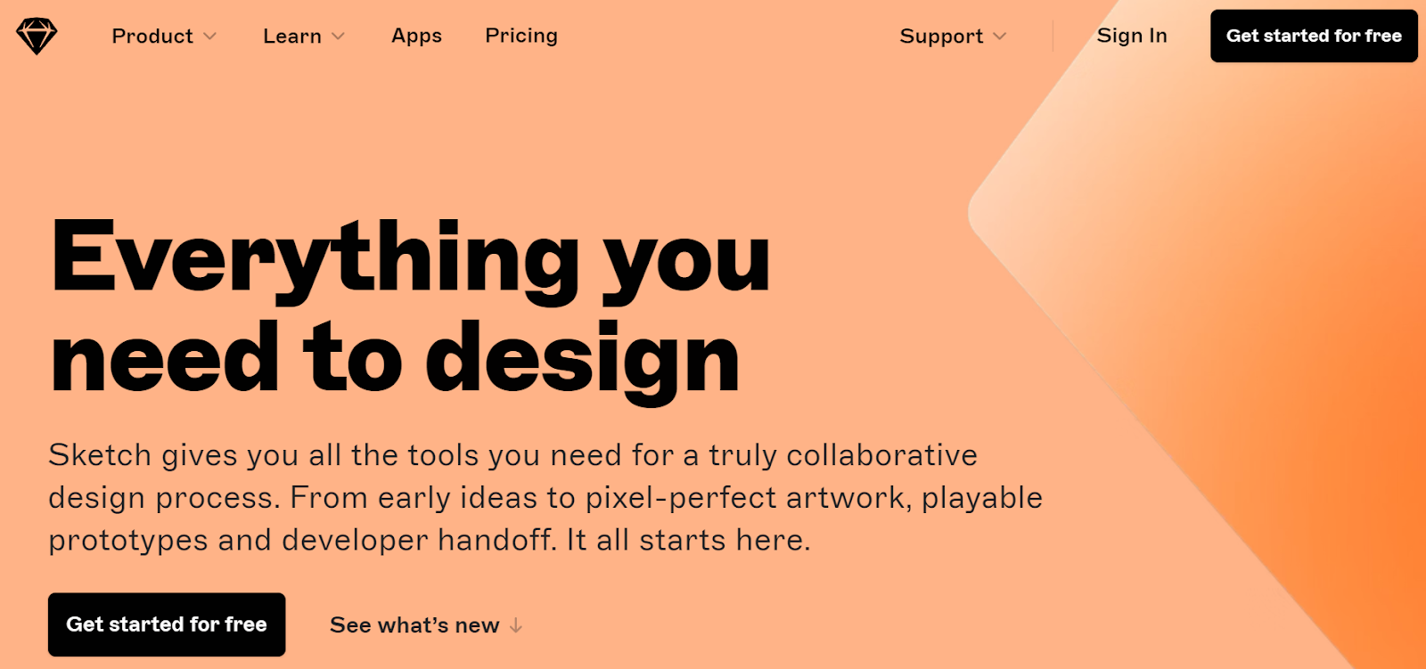
Source: Sketch.com
FullStory, a digital performance analytics SaaS tool, doesn’t even try to work around a pretentious way to show their future clients what they’re all about. They simply say, “Here, these are the results of using our service.” It’s simple, informative, and effective.
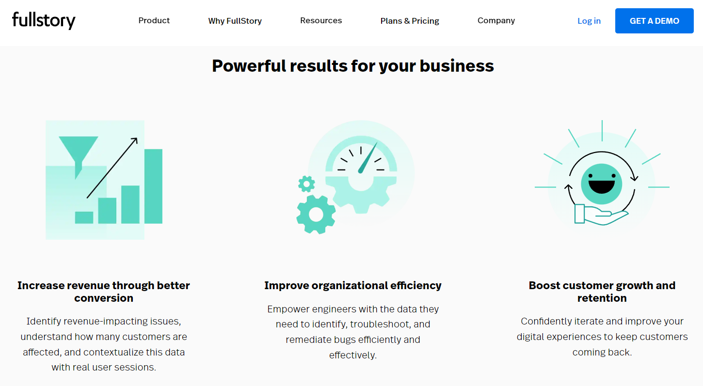
Source: Fullstory.com
Make It Obvious That You’re Available in Person
To show that you care about your clients, you need to provide proof that you’re always there for them. When you include multiple communication channels, especially a toll-free phone number, you can expect your customers to express gratitude and offer their trust and loyalty in return.
Providing accessible customer support options enables the “human touch” that all customers appreciate having when purchasing your subscription-based products or services. Knowing that real humans work non-stop to make your tools available at all times goes a long way toward converting your customers into long-term partners.
In short, it’s important not to hide behind a support wall. Work on providing as many customer support options, and place them in visible, intuitive spots. The options may include a custom client portal, live chat, email support, and a dedicated phone line. The more you have, the better.
Here are some of the most important customer service options you should consider incorporating into your SaaS website:
- Email address
- Phone support
- Chat element
- Online contact form
- Social media links
GetSafe, a medical alert system provider, is a good example here. They feature a phone number in several places across their website, with the most prominent one being on top of their homepage. To align with the elderly generation, which makes up the bulk of their client base, they prefer this contact method over a digital contact.
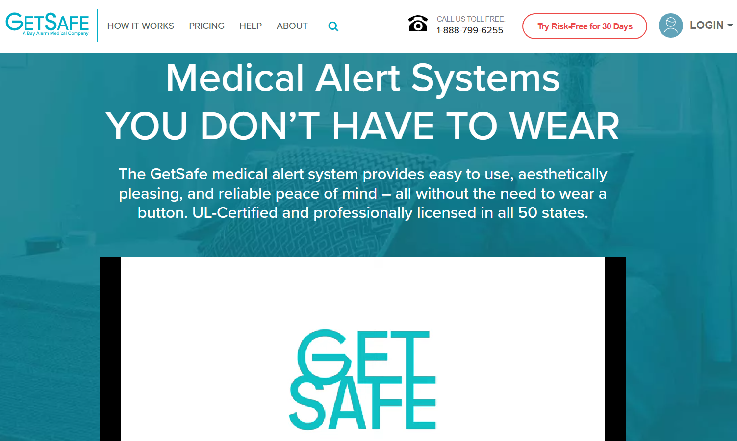
Source: Getsafe.com
Gusto, a digital payroll management service for teams, leverages the power of AI and offers a chatbot that helps with the customer support process. The tool can answer tons of questions customers may have, and it is skillful in directing the questions it cannot answer to real customer support agents.
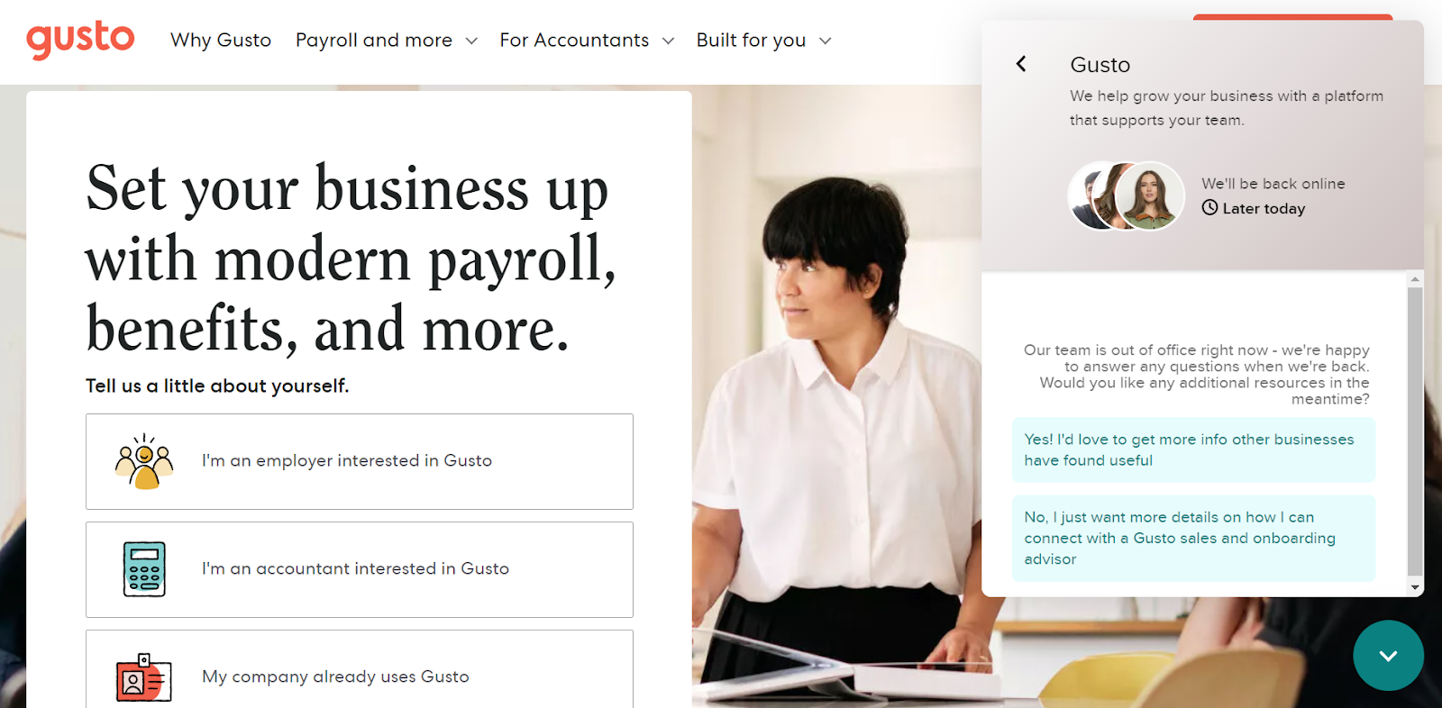
Source: Gusto.com
Give Your Users Something for Free
Being generous is another marketing strategy that leans on the psychological aspect of putting out a good word for your business.
Many SaaS companies are known for offering free trials or money-back guarantees as a sign of initial gratitude for showing interest but also to let their prospects try and test their tools.
What customers appreciate even more than the above two “marketing tricks” is a product that they get for free. And it’s even better if you manage to offer it without having them sign up or register on your website. This not only gives potential customers the ability to evaluate your product but also makes them associate your brand with a positive feeling.
One example here is MarketBeat, a website that provides high-quality stock research tools and real-time financial data. They feature a dividend calculator, which is incredibly useful but completely free for everyone.
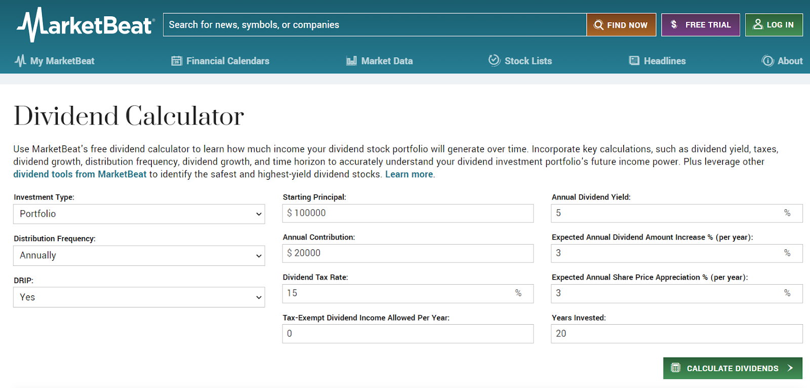
Source: Marketbeat.com
Simplify the Signup Process
If there’s something customers really hate when exploring their options, it’s having to give out private information that seems unrelated to the product/service they want to buy.
As a SaaS business leader, you need to decide what you need from your customers and only request the most necessary details when you have them sign up for your offer.
This is especially important for the free trial version. If your main sales process happens after the user is already using the trial version, make the initial signup as easy as possible. Limit the number of fields you need to the bare minimum.
Asking for payment details when you offer something on trial can demotivate many of your potential users. So, don’t ask for this info until you have to.
For a great example, check out how Jotform excels with its signup process. This online form builder features its signup form on the first loading screen of its website and offers multiple options for registration (email, Google, and Facebook). This enables Jotform’s visitors to sign up with a single click.
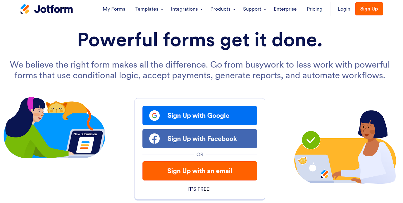
Source: Jotform.com
Wrapping Up
The SaaS universe is getting bigger by the day, and standing out can be quite a challenge. However, creating a website that places your users’ needs and preferences front and center can mean a great deal to their conversion.
The best SaaS website design practices that we feature in this article can help you attract the right visitors to your corner of the digital world and convert them into loyal customers. There are, of course, many other elements of excellent website design, so if our expert tricks don’t work for you, consider performing a thorough revamp of your website. The issue might lie elsewhere.