Building Product Tours: The design process behind our onboarding tool

Main illustration: Tim Gilligan
Every product design project is a bit like climbing a hill. You ascend the hill to gain perspective on the surrounding terrain, but you don’t know what’s on the other side – you’re figuring out how to approach the problem, and you uncover and resolve the unknowns.
Once on top of the hill you have a clear view – you can see the shape of the landscape and make out the path down, you can picture what needs to be done to make progress.
This is a story of climbing uphill for Product Tours, our recently launched onboarding tool. It is a story of how we went from a broad problem to a validated concept through various twists and turns, and how we used feedback loops along the way to course correct our approach.
Starting in broad strokes
A high-quality customer onboarding experience is crucial for long-term growth of a business. All too often, however, those onboarding experiences can leave customers stumbling around in the dark without sufficient guidance to get started.
Our in-app messages are a great tool for engaging in conversation with new signups and telling them how to get started, but they weren’t designed to show them.
To fix this we began by writing an Intermission, our name for a project brief, and defining the Jobs-to-be-Done for this problem:
- Primary: When a new user arrives in my product, I want to guide them through the core elements and get them set up so that they start to get value from the product as quickly as possible.
- Secondary: When we release a new feature to our existing users, I want to make people aware of the new feature, orient them and help them get set up so that they can begin to get value out of the new feature.
In addition to the Intermission, we set out guiding principles that we believed in, principles that would provide a framework for evaluating our options and help us in making decisions:
- Learn by doing: You should learn by actively engaging with the product, not passively reading about it.
- Take advantage of the Intercom platform: Intercom offers a whole suite of tools that you can use to engage with customers. Our solution needs to fit in and leverage the rest of the Intercom.
- Drive key activation and engagement metrics: Our solution needs to prove that it’s impacting the metrics you care about.
“We wanted our solution to be oriented around the ‘aha’ moment”
Seeking direction at this early stage, we relied on some of our research which found that many products have an activation metric to measure if the customer has turned into an active user. They also have a related but distinct “aha” moment when new signups really understand and see the value of the product for themselves. We wanted our solution to be oriented around the “aha” moment and measurable by the activation metric.
We looked at real products that serve our target audience and considered how a great onboarding experience might look like for them. Product tours had been one of the top feature requests for some time, so we knew there was a demand for it. And we already had a few ideas that we had been talking about for a while and were eager to test – simple pointer messages that you could use to highlight something in your product, fully interactive tours where users would be walked though how to use the product, and video tours where you could talk your users through the product.
To test these ideas out, we quickly created multiple opinionated and distinctive prototypes in Invision that captured these ideas. We designed realistic onboarding flows for real products. The goal was not to design the actual solution that we’d want to ship to everyone, but rather to better understand the space by creating a few tangible ideas that we could test ourselves and with our customers.
We focused only on the end-user experience, ignoring how a customer might set it up behind the scenes in Intercom. Once we’d know what a good end-user experience looks like, we’d come back and figure out how it could be set up.
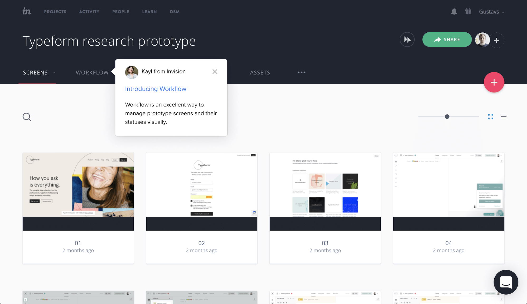
Early concept for simple pointer messages
Early concept for interactive tours
Early concept for video tours
Validating with customers
After making these early concepts more tangible, we were excited about the potential of Product Tours. But to better understand if that’s what our customers really needed, we combined the best ideas from all of them into one concept and set up interviews with businesses that had requested product tours before and with end-users who would experience them.
During these interviews we asked companies about how they currently solve this job, what’s working, and what isn’t. Then we showed them a simple Invision prototype and asked them to go through it and tell us what they’re thinking. We received a lot of positive signals, particularly about how to interact with the product to proceed. On top of that we learned about specific ways businesses would use these tours, and the questions and concerns that arose.
Based on these findings we were happy to proceed further with product tours and explore them in more detail.
Turning it into a system
Now that we had an approximate idea for how end-user experience might work and determined that there was demand for it, we had to figure out how it would fit into the wider Intercom product and how we would design the system behind it.
Since one of our principles was that our solution would take advantage of the existing Intercom platform, we wanted tours to be reusable objects that could be sent anywhere; inserted when talking to customers via the Inbox; embedded in messages and articles; and triggered automatically by themselves. Furthermore, you should be able to measure how effective the tours are across all of these channels.
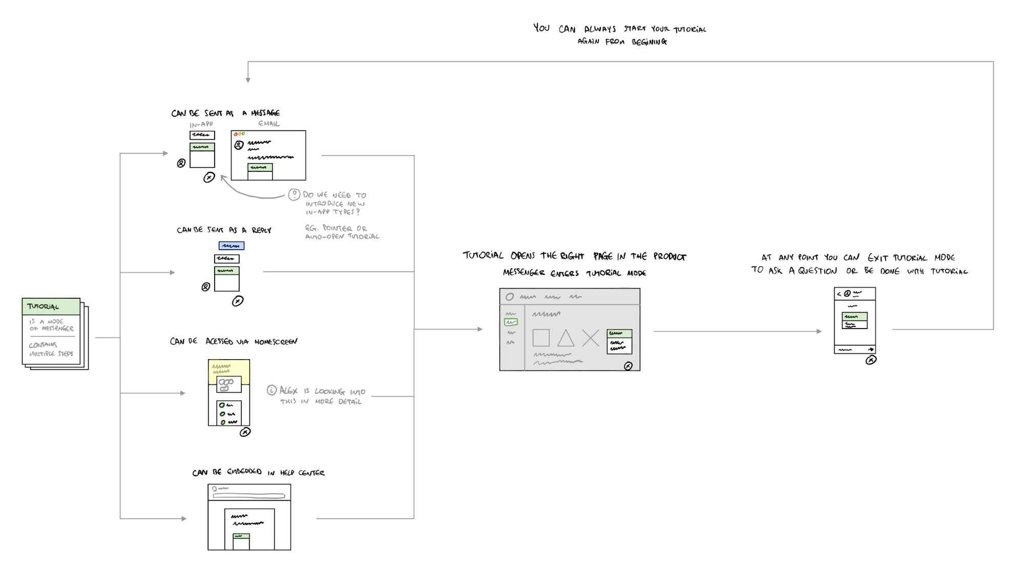
System model for tours
Starting small to learn
We had found a high-level solution that the whole team was excited about and we saw clear demand from our customers. Had we reached the top of the hill? We could begin our journey downhill by breaking it down into concrete tasks we should design and build. But we avoided that temptation.
One of our product principles is “think big, start small,” which means that we think ambitiously, but always try to find the smallest coherent solution that goes in our desired direction while enabling us to ship and learn early.
So we took a step back to think about how we might do that. We broke the idea of interactive tours down into a spectrum of options of varying levels of sophistication:
- Pointer in-app message type
- View-only tours
- Basic interactive tours
- Advanced interactive tours
- And a whole different take on how to solve the underlying job – onboarding checklists
For each of them we considered:
- How effective is it against the jobs to be done that we originally set out?
- How easy would it be for companies to set up?
- What’s the level of change necessary to our existing product?
- What’s the effort to build this?
1. Pointer in-app message type
We already had multiple types of in-app messages, so the most basic version of tours might be to introduce a new in-app message type that can be pointed at anything in an interface.
It would be a simple solution that requires little change to our existing product and would be easy to ship and learn from, but it would only solve one of the two jobs we want to solve – announcing new features, rather than a comprehensive onboarding experience.
2. View-only tours
The second option was stringing multiple pointer messages together to create view-only tours. You could point things out in your product and talk about them, guiding users across multiple pages, but they wouldn’t be able to interact with the product themselves.
In addition to working well for announcing new features, this could also be used for guiding new signups though your product. But it was against one of our guiding principles of “learning by doing”. While better than just reading about your product, it still would be a passive experience.
3. Basic interactive tours
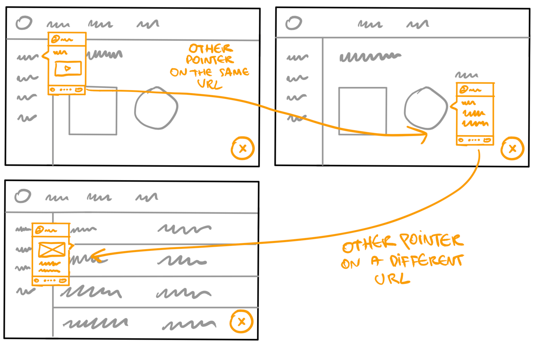
We could take it a level up by introducing the ability to progress the tour by clicking on the element that is being highlighted by the pointer message This would make tours much more engaging by enabling users to learn by doing.
But we had concerns that it might be too easy to get into situations where the tour breaks. For example, if a message point out a submit button and a user clicked on it, they could end up getting an error because they hadn’t filled out all of the fields. Since the tour would only track clicks on the submit button, it wouldn’t be aware that the product was actually not in the right state and show you content that doesn’t make sense in the context.
4. Advanced interactive tours
To remove this brittleness problem we came up with a more advanced way to detect if your product is in the right state – instead of tracking clicks we’d look for a specific element that only appears when you’re in the correct state of the product.
This seemed like an innovative solution that was likely to produce the most reliable tours, but it would be a design challenge to enable customers to easily set up such tours.
5. Onboarding checklists
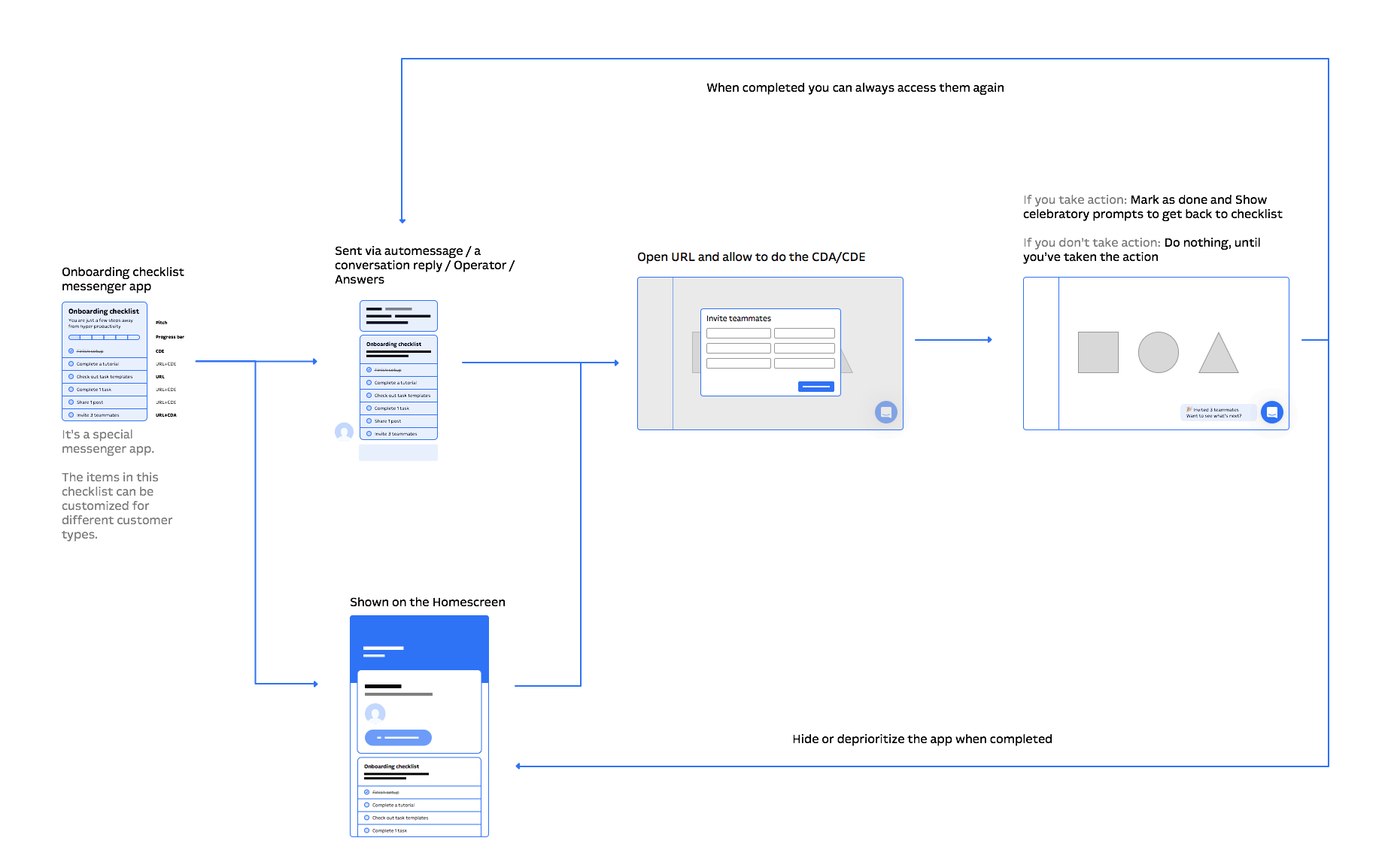
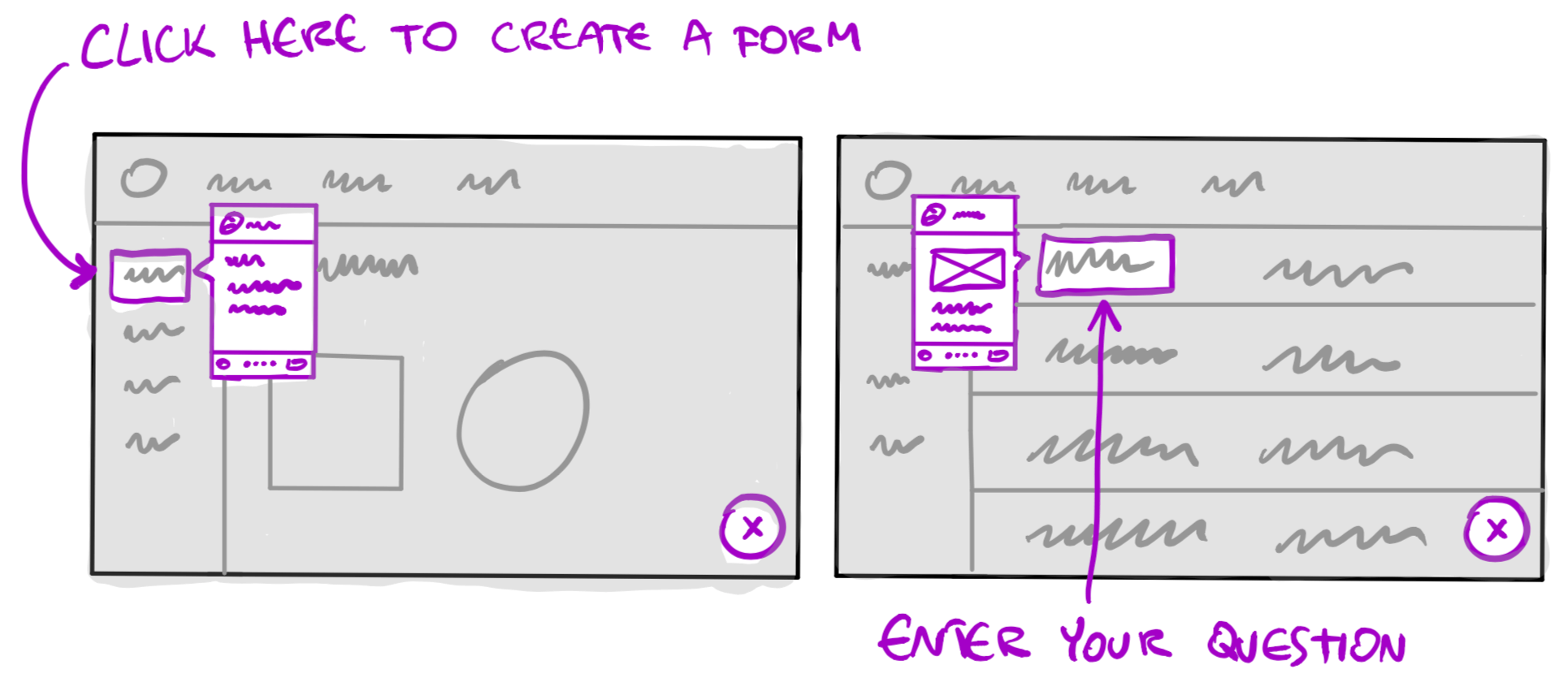
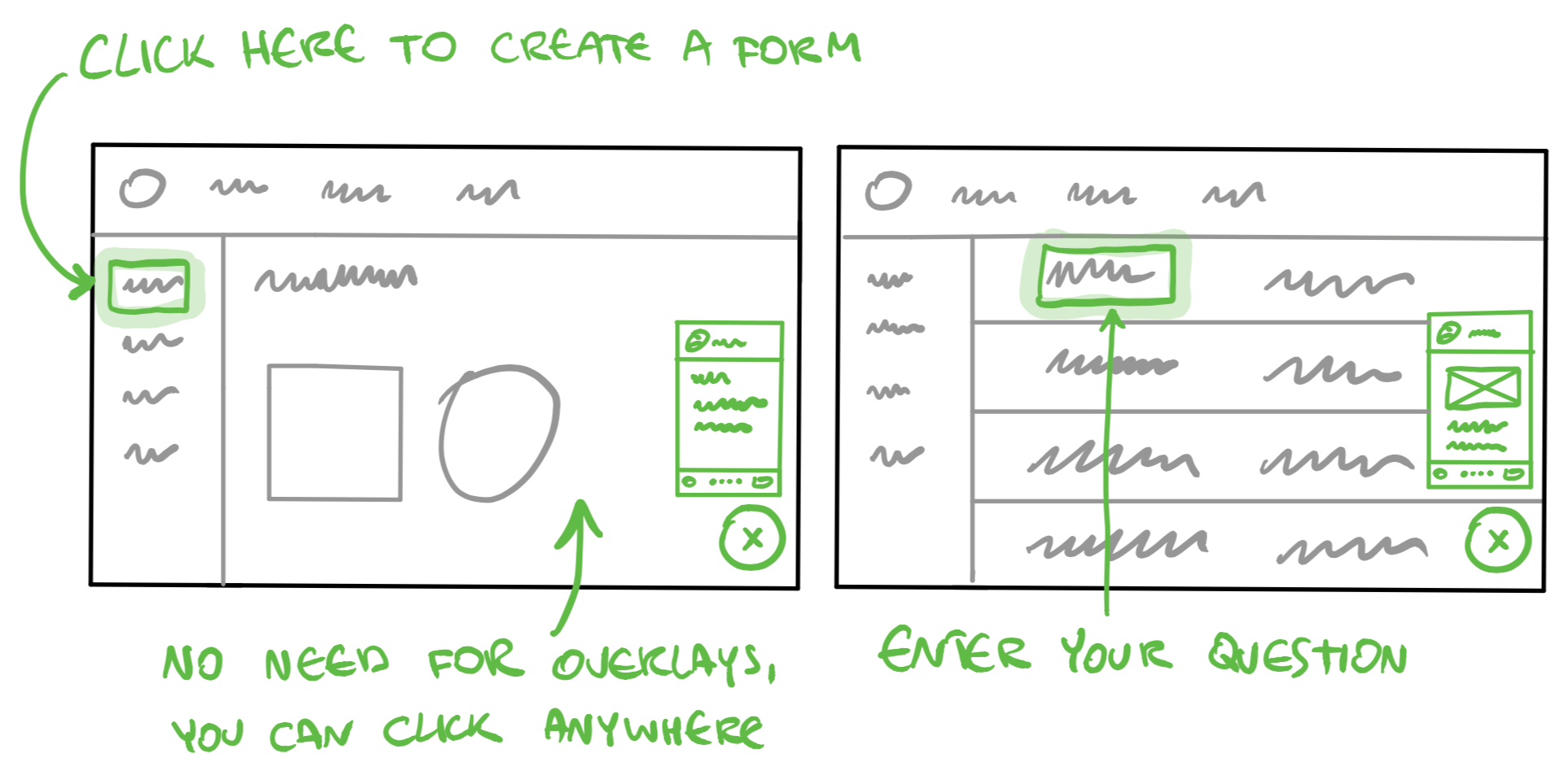
While thinking about the spectrum of options for tours, we also considered whether we should take a completely different approach to solve the same underlying problem. Instead of guiding new signups through the product, we could present a check-list of activities they should do. So instead of showing you how to do something, we would tell you what to do and guide you towards it.
Making a decision
We came to the conclusion that Product Tours and checklists are not competing options, but instead they’re complementary. We could do both. But since we had heard so much positive feedback about Product Tours we decided that it represented the bigger opportunity to begin with.
In the spectrum of options for Product Tours we decided to proceed with the advanced interactive tours because it solved the jobs best, was a lot more reliable than basic tours and wasn’t much more expensive to build.
But we knew we’d have to solve a big design challenge – the tour setup process was going to be more difficult to understand than just selecting a button and saying that the tour should proceed if users click on it. Instead you would have to select a unique element that only appears after a user performs an action.
This was the type of a design problem where you can only really evaluate it when you use it with real data. So after designing a few interactive prototypes in Invision, myself and Eoin Nolan, a principal engineer on our team, paired up to create a prototype that would allow you to build real tours on real products.
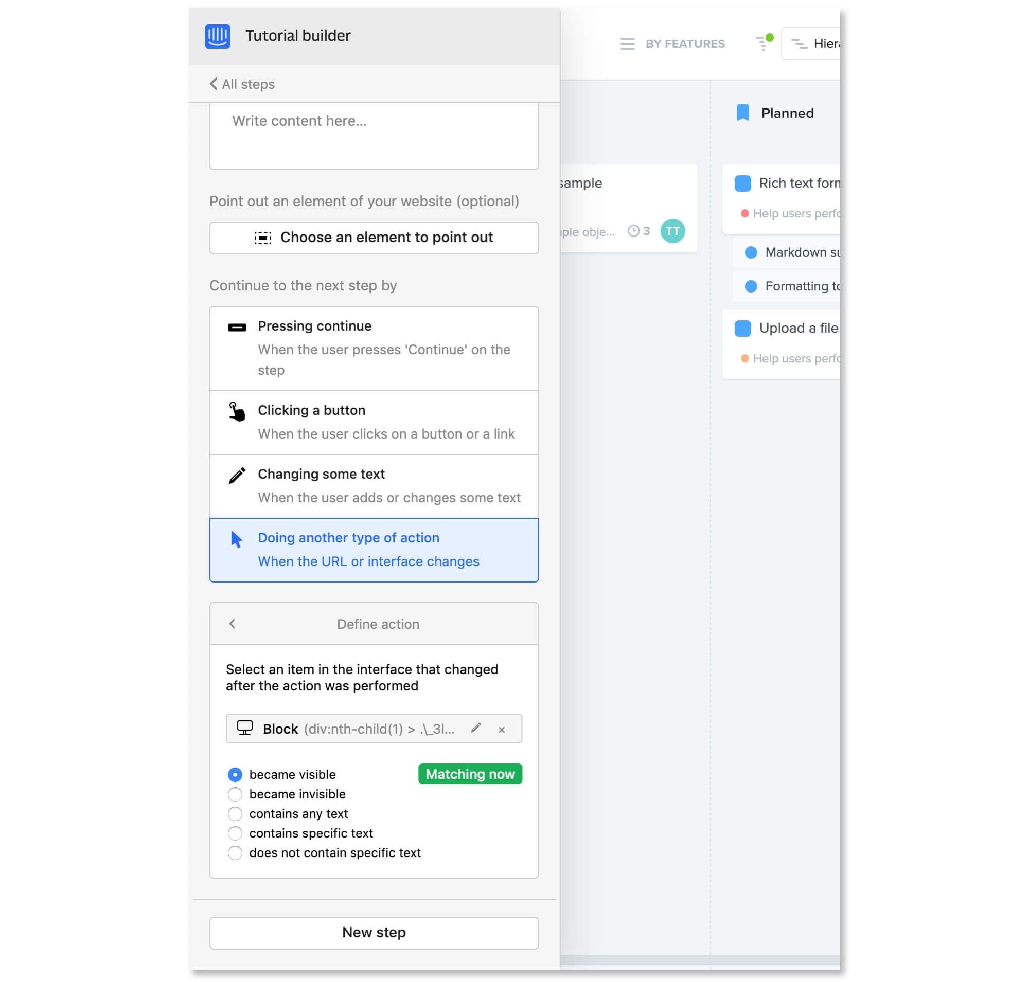
Our prototype for building real tours
Our motivation at this point was merely to learn if companies could easily build tours for themselves, so we didn’t invest a lot of time in getting the design just right or writing the code to be of production quality.
This ended up being a much better way to test our design because we could test it on any website and try out a bunch of different types of tours quickly. And because we didn’t build production quality code or design, we could move very quickly.
To put it to a real test we set up interviews with customers and asked them to create tours on their own sites.
User feedback
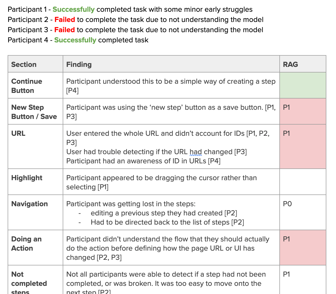
We ended up doing multiple rounds of testing, each time iterating on our design based on previous findings. But ultimately the results were mixed. Some customers were able to build their tours without any problems while others got very confused and were unable to create tours because their mental model for how the builder should work didn’t match what we had built.
Going beyond the product design
In addition to these findings, we were hearing from the leadership team that they had concerns about the business and market implications for this direction. They were concerned that this might be too powerful and complex for our target audience. Given its complexity, would only a small portion of our customers use it? Would most businesses be better served with something simpler?
To test these concerns, we decided to evaluate our spectrum of options against these additional criteria:
- What appeals to the broadest market?
- What appeals to our top customer segments?
- What appeals to adjacent use cases?
We went back to our options and evaluated which ones could add most value within the constraints of these criteria.
At that point, we concluded that we should move forward with view-only tours. While this required us to reconsider the importance of our initial guiding principle of learning by doing, we determined that view-only tours would be adequate for the majority of our customers across different use-cases and still represented a big market opportunity.
And importantly, proceeding with view-only tours would also allow us to ship and learn earlier and avoid investing a lot of time and effort in finding the perfect solution for the more complicated set up process. If we found that it’s important later down the line we could build it on top of view-only tours.
“Our initial principle that our onboarding solution had to encourage learning by doing was vindicated”
This gave us enough confidence to shift from an uphill exploration mode into downhill execution mode, but continued to evaluate our solution with real customers along the way.
It was during beta that we realized the direction we were taking with view-only tours was indeed too simple and limited – many beta testers expressed their need to allow users to progress the tour by interacting with the product. Our initial principle that our onboarding solution had to encourage learning by doing was vindicated, so we carefully increased the scope and reintroduced the ability to progress the tour by interacting with the product.
That time spent building view-only tours was not wasted, however – by beginning with the simpler approach first we were able to ship and learn early, avoid over-optimizing for an advanced feature, and made the most common use-case simple and focused.
Lessons after climbing the hill
There were a number of lessons to take away from this:
- Look for opportunities to include many feedback loops in your design process. They enabled us to make rapid, informed decisions and course correct our approach based on what our customers really need.
- Consider that the most effective and innovative solution might not be the right solution. By considering market and business needs you can understand where the biggest opportunities lie and you might be able to achieve more with less.
- This approach might take you back to the solution you had in your head from the beginning. And that’s okay. After going through this process we gained so much more confidence that it’s the right thing for us, our customers, and that we’re not missing out on different opportunities.
Ultimately we believe that Product Tours will enable businesses to grow by onboarding their new signups in an engaging way that drives them to success. Give it a try.