When you create sales pages that convert, you take some of the burden off your team. You don’t have to constantly be hustling to find prospective customers.
They come to you.
But let’s face it: Traffic doesn’t mean much without conversions. You need people to buy what you sell.
Today, we’re going to talk about how to create sales pages that convert.
I’ll provide you with some strategic tips and show some examples. We’re going to cover lots of information, so feel free to skip around:
- What are sales pages?
- Sales pages versus landing pages
- Long-form versus short-form landing pages
- How to create sales pages that convert
- Examples of the best sales pages in 2018
What is a Sales Page?
A sales page is a page on your website that has one goal: Convince people to buy.
That’s it.
It needs to provide an offer so compelling that your target audience can’t say “no.” The best sales pages convert because visitors feel like they have to act.
See how our tools can improve your conversions
Sales Pages Versus Landing Pages: The Differences
Sales pages and landing pages have lots of things in common. They’re both focused on a singular goal.
A landing page, though, doesn’t have to involve a sale. You might create a landing page to get people to sign up for your email newsletter or register for your webinar.
Long-Form Sales Page Versus Short-Form Sales Pages: Which One is Better for Conversions?
It would be great if this question had a simple answer, but it doesn’t.
Short-form sales pages work really well in ecommerce and for lower-end products. You don’t need a ton of copy to convince people to convert.
But what if you’re selling a more complicated or extremely expensive product or service? You’ll need more words to convert your visitors.
Here at Crazy Egg, we use long-form sales and landing pages. We deliver as much information as possible so people really understand our product.
Long-Form Sales Page Advantages and Disadvantages
Many marketers swear by long-form sales pages. They give you plenty of room to share what you love about your product or service. Plus, they’re great for SEO.
Advantages:
- More opportunities to convince your visitors to buy
- The chance to address and overcome objections
- More copy on the page for SEO benefits
- Space for multiple CTAs
Disadvantages:
- The potential for information overload
- The possibility of boring or irritating your visitor
Short-Form Sales Page Advantages and Disadvantages
In some cases, though, long-form sales pages aren’t appropriate. They actually do more harm than good.
You can use short-form sales pages when it makes more sense for your product or brand.
Advantages:
- Convert visitors quickly and simply
- Distill benefits and features into a few key points
- Have all the information “above the fold”
Disadvantages:
- Visitors might have more questions than you answer
- You might have to leave out information that might otherwise convert consumers
- Fewer SEO benefits
How to Create Sales Pages that Convert: 20 Tips
Learning how to create sales pages that convert is a process. Not only do you need to familiarize yourself with best practices, but you also have to figure out what’s best for your audience.
Continually test your decisions. Figure out what works and what doesn’t with your target market by testing lots of different pages.
Until you have the results of those tests, follow these 20 tips to create a sales page that converts right out of the gate.
1. Define your target audience
Before you can convert people, you need to know them. What do they want? Need? Love? Hate? Struggle with?
The more you know about your audience, the stronger your sales pages become. Your prospects will feel like you’re inside their head. When you use the exact language they’re already using, they’ll desperately want your product.
2. Make your offer clear and concise
A complicated offer turns potential customers away. If they can’t understand what you’re offering, they won’t stick around to try to decipher your message.
Your sales page needs a headline, right? Make it an offer visitors can’t refuse. Lead with a benefit of the product or service, then mention what you’re selling.
Get it down to one crisp sentences.
For instance, let’s say I want to sell an email app. I might use a headline like this: “Get to inbox zero within 15 minutes.”
The offer is clear: quickly and easily manage all your email to clear out your inbox.
3. Build your conversion funnel and optimize it
The sales page should represent part of your overall conversion funnel. The funnel itself needs to be designed around your audience.
Funnels look different based on customer behavior. For instance, there’s typically a shorter funnel when you’re selling running shoes than if you’re marketing a high-end racing bicycle.
Optimize every segment of your conversion funnel so that, when visitors land on your sales page, they’re ready to convert. They already have all the information they need to make a split-second decision.
4. Create the perfect call to action (CTA): What do you want your users to do?
Think of the CTA as the answer to the headline. You’ve proposed something to your audience — what do you want them to do with it?
Let’s say you’ve written a headline like this for your sales page: “Create Your Custom Racing Bike From Scratch.
Now, you need your CTA button copy. It could look like this: “Build Your Bike Now.”
You see these types of headlines and CTAs on car manufacturer sites all the time.
Test different CTAs to see which ones perform the best. The more you test, the more refined your CTA becomes.
5. Add several CTAs—but not too many
On a long-form sales page, there’s nothing wrong with multiple CTAs. However, they should all lead to the same conclusion.

The idea is to continually reinforce what you’re asking. Remind visitors why they’re on the sales page in the first place.
They can either keep reading down the page or convert immediately. You get the best of both worlds.
You don’t want to cram 50 CTAs on a sales page, though. Make sure you’re adding content between them to give visitors a reason to continue reading.
6. Consider design variations: Test to see what your users are doing
Design matters when it comes to conversions. A simple change — such as the color of your CTA button or the image you use to show off your product — can make or break the deal.
That’s why you have to test. A/B tests allow you to change just one variable at a time so you get accurate data. Continually test new design elements to see which ones perform best.
7. Make your sales page simple
Even long-form sales pages shouldn’t be overwhelming. They need to present information in the easiest, most digestible fashion possible.
Start by creating lots of white space in your design. Leave breathing room between individual elements, like graphics or copy.
Distill information down into as few words as possible. Get the big picture front-and-center so your visitors focus on it rather than the smallest details.
8. Learn how to write a sales page that converts: The best copy
Writing copy for a sales page requires an understanding of persuasion. After all, that’s what you want to do, right? You’re persuading people to convert.
Start by telling people what you want them to do. Use strong verbs and an authoritative voice.
Focus on benefits instead of plain-jane features in your copy. For instance, instead of mentioning your racing bike’s wheel construction, explain what benefits buyers will derive from it.
9. Test strong headlines
Headlines can make or break your sales pages. Just like CTAs, they’re among the most commonly read elements on any web page.

[tweet_box design=”default”]The headline should entice visitors to read on, especially if you’ve created a long-form sales page. A/B test different possibilities so you know what works best.[/tweet_box]
10. Add bulleted text to describe your product’s benefits
One way to create more “breathing room” on your sales page is to break down information into bulleted or numbered lists. You don’t have to write in complete sentences:
- Benefit 1 and short description
- Benefit 2 and short description
- Benefit 3 and short description
Bulleted and numbered lists are also beneficial because they attract attention to themselves. They’re more scannable, too, which makes readers happy.
11. Make sure that your sales page is mobile-friendly
Responsive design matters for every page of your site, but especially sales pages.
If people want to buy from you via their tablets or smartphones, you don’t want to give them a reason to abandon their shopping cart.
12. Add photos, videos, and illustrations
Graphics communicate information faster and captivate your audience visually. It’s more fun to look at a page with photos, videos, and illustrations.
Videos, in particular, can help convert more customers. Consider creating an explainer video, for example, to demonstrate your product’s or service’s value.
13. Add social proof, case studies, and testimonials
You might notice that we use social proof a lot here at Crazy Egg:
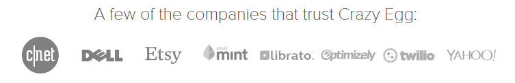
It’s a great way to demonstrate that other people love working with us. Specifically, we mention high-profile companies who trust our tools.
You can do the same, whether you post logos of companies you’ve worked with, testimonials from satisfied customers, or links to in-depth case studies.
14. Offer a guarantee
Guarantees are great for conversions. They make consumers feel safe.
Let’s say that you’re going to spend $100 on a new pair of shoes. That’s your budget, and you’ve found two options on two sites.
One offers a guarantee. The other doesn’t.
Which one is most likely to get your $100?
15. Eliminate distractions: Test removal of navigation links
Unnecessary links can easily distract your sales page visitors. While internal links can improve bounce rates and increase time on site, they also lead your visitor away from the sale.
Test your sales page with and without navigation links. You might find that your site performs better when you remove the navigation bar entirely on these pages.
Alternatively, test a shorter navigation bar. For instance, it might just include a link back to your home page.
16. Incorporate social media share buttons
If you visit my personal blog, you’ll find lots of social share links.

This article is extremely recent, yet people have already shared it more than 400 times.
Sharing blog posts is great, but you also want people to share your sales pages. Social media share buttons make the process easier — and your visitors more likely to follow through.
17. Add a sense of urgency
I like to add a ticking clock when I can. It’s a great strategy for sales pages because you want consumers to make quick decisions.
For instance, you could use a flash sale to encourage conversions. You’re offering a reduced price, but only if the visitor acts within X hours.
You can also create urgency through desire. Manufacturers of weight-loss products do this all the time.
They might say, “Do you want to shed those last 15 pounds? Why wait?”
18. Add live chat
We use EggBot on the Crazy Egg website to increase engagement with our visitors.

People who want more information can converse with EggBot (and get closer to a conversion).
These days, it’s all about engagement. You don’t want visitors to be passive. You want them to take action.
Plus, you can use a chat bot or live chat function to overcome objections or answer questions you don’t cover on your sales page.
19. Create a FAQ section to handle objections
FAQs are also extremely useful. Wipster does it beautifully on its sales page:

It’s a fast way to disseminate information without distracting your visitor from the conversion.
[tweet_box design=”default”]If you use bold subheadings and lots of white space, the FAQs won’toverwhelm visitors.[/tweet_box]
This is where you should respond to potential objections.
Anticipate issues your prospective customers might have with your product or service and explain why they aren’t really issues.
20. Try exit-intent popups
An exit-intent popup works extremely well when you want to give visitors a last chance to buy. You can use the popup to offer an exclusive discount or a bonus freebie — or simply to confirm that the visitor really wants to leave.
Hello Bar creates great exit popups:

You can create any popup you like and decide when visitors to your sales page see it.
Best Sales Pages Examples in 2018
Now that we’ve covered some of the best tips on how to create sales pages that convert, let’s look at some real-life examples. We’ll look at high converting sales page examples in detail and figure out why they work.
1. Authority: Why it Works
Our first example comes from long-term blog and exceptional resource Copyblogger. The company’s Authority program provides advanced training for people who want to become better content marketers.
It also has a fantastic sales page.

I like it because it gets the offer right out in the open. You don’t have to scroll to know what Authority offers.
Below the main graphic, there’s a subtle downward arrow. Think of it as a visual cue to keep reading.
Then you have information designed to connect with the reader. The copy shows that Copyblogger and Authority understand the problems content marketers face.
The page also incorporates lots of benefits, social proof, and CTAs.
2. Muck Rack: Why it Works
Our second example is Muck Rack. It’s a site that connects journalists and PR professionals. Its sales page for PR pros works well on a number of levels.

There’s a headline that changes on a loop, a subheadline to explain the offer, and some body copy to further elaborate on Muck Rack’s benefits. You’re hit immediately with a CTA.
Further down the page, you get social proof, benefits with corresponding images, and lots of white space. Then, at the end, you get a CTA that perfectly mirrors the first one.
3. Teambit: Why it Works
Lastly, let’s take a look at Teambit. It follows many of the strategies I talked about above, but it doesn’t shy away from creativity.

Teambit tells a story for its sales page (which is also its home page) and incorporates whimsical, fantastical drawings.
Still, you get the familiar elements: CTAs, social proof, and responses to potential objections.
How Crazy Egg Tools Can Help You Make Top-Converting Sales Pages
Crazy Egg provides a suite of tools to help you make your sales pages even more likely to convert. Scroll maps, for instance, are ideal for placing CTAs. If you know when most of your visitors stop scrolling on your sales page, you’ll know where to put the call to action.
Heatmaps are also invaluable. Figure out where visitors click so you can optimize those areas for conversions. Use Crazy Egg’s A/B testing and other tools to maximize every sales page for more conversions.
It’s great to have the best practices in place, but sometimes you need extra help. Sophisticated tools remove some of the leg work from developing high-converting pages, which inevitably makes your life easier — and your bank account larger.
Conclusion
Once you learn how to create sales pages that convert, you can start raking in more cash.
It’s all about figuring out what makes your visitors tick, then capitalizing on that knowledge.
Optimizing your sales page for conversions can take some of the burden from your sales team and allow your website to work for you more efficiently. Other pages matter, of course, but you really want people to buy.
A sales page has one goal: get people to convert. Remove anything that distracts from that goal.
You can test long- and short-form sales pages to figure out which will work best for you. Then put into practice my 20 tips for creating sales pages that convert.
What’s your best tip for creating high-converting sales pages?